


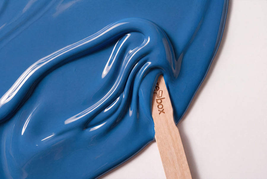
Blue paint colours make up the category with the widest range in our collection: 18 shades, starting with a pale hazy blue and ending with a midnight blue that looks almost black in low light. What they share is the material — a silky-gloss furniture and multi-surface paint — and the fact that blue looks different on wood than it does on paper.
Buy blue furniture paint: 18 shades, silky-gloss in 750 ml
Each of these 18 shades comes as re-box protect, the furniture and multi-surface paint for furniture, wood and interior surfaces. One container size, 750 ml. One finish, silky-gloss. And no stock goods: tinting only begins once your order has come in.
The same shades are also available separately for walls, there in matt or silky-matt. Combine both, and you can paint the wall in a calm finish while setting the door, the shelf or the chest of drawers against it in the same blue with a touch of gloss. Two finishes, one shade — the simplest way to a room that looks like it was planned.
How blue works in a room
Blue is the only colour that can recede and carry weight at the same time. A pale blue visually pushes a surface back and makes the room feel larger. A deep blue does the opposite: it brings the surface forward and turns a single piece of furniture into the anchor of the room.
The undertone makes all the difference. Blue with a touch of grey stays calm in any light. Blue with a hint of green feels warmer than the name suggests, and pairs well with wood and natural materials. Blue with a touch of violet is the most dramatic route and needs scale to work.
Light flips the equation: in north-facing rooms, where daylight already falls cool, a clear blue can turn cold — there, the muted, slightly greenish or greyish shades are the safer choice. South-facing rooms can carry the bolder blue, because the warm sun balances it out. In the evening, under warm lamplight, all blue shades lose some of their clarity and turn deeper.
From haze to midnight: the 18 blue shades
Five groups, sorted from light to dark. Two shades sit deliberately at the edge of the family: Blooming Tisane No. 37 and Bramblewood No. 6 bring a distinct natural note and are worth a look if pure blue feels too direct for you.
Blue that stays almost white
From a distance, these shades read like a pale grey, only revealing themselves as blue over a larger surface. Gesso Clair No. 57 Lack is the most understated of them. Nice Breeze No. 36 Lack and Brise d’Été No. 61 Lack bring a bit more freshness, while Celadon Tide No. 3 Lack stays matter-of-fact. For doors in small rooms, this group is the safest bet.
Blue-grey and mist
This is where the blue that feels most at home in a classic German apartment sits. Dove Horizon No. 26 Lack has a soft, dove-grey pull, Fjord Mist No. 39 Lack a cooler one, Loom Spirit No. 14 Lack a textile-like one. All three sit well with pale floors without turning them cold.
Clear mid-blue
The group people mean when they simply say blue. Azure Bay No. 25 Lack is the most open shade in the range, Bleu Faïence No. 64 Lack brings to mind glazed ceramic, Harbour Blue No. 18 Lack has more depth and a touch of harbour water. One piece of furniture in this shade is enough per room.
Blue with a green or violet cast
The most intriguing group, because it never quite settles. Bleu Salon No. 63 Lack leans towards the drawing-room, Cobalt Husk No. 35 Lack towards the pigmented, Velours Shade No. 22 Lack towards the velvety with a violet undertone. These shades shift the most with the light — this is where a sample test pays off the most.
Deep blue and night
At the far end of the scale sits a blue that can stand in for black without bringing its harshness. Blue Dark No. 27 Lack is the classic dark blue, Océan Nuit No. 65 Lack the deep one with a marine cast, Baltic Midnight No. 24 Lack the darkest of the family. On a sideboard or shelving, they read as sophisticated rather than gloomy.
What pairs with blue
Blue is remarkably easy to live with, as long as you get the white right. A sharp, pure white next to it makes any blue look harsh. A broken, slightly creamy white softens that same blue.
- 👉 Oak and ash: lift pale and grey-blue shades without competing with them.
- 👉 Walnut and dark woods: belong with the deep blues, both bring weight.
- 👉 Brass: the warmest contrast to a cool blue, especially on mid and dark shades.
- 👉 Black fittings and steel: turn a mid-blue into a graphic surface.
- 👉 Beige and sand tones as a wall colour: the calmest setting for a blue piece of furniture.
Blue lacquer, room by room
Living room
A shelf or sideboard in a deep blue gives a bright living room the centre it often lacks. Keep the rest light — otherwise the effect tips from calm into heavy.
Bedroom
Blue-grey is the obvious choice here: it settles the mood in daylight and softens under lamplight in the evening. Bedside tables and a wardrobe in the same shade feel more cohesive than three different woods.
Kitchen
Blue fronts are the classic that never quite goes away. Take the doors off and lacquer them lying flat, so nothing runs and the edges stay clean. Fronts are where protect's resistance to mechanical wear and everyday marks really counts.
Hallway
Doors and frames in a mid-blue give a narrow hallway definition without closing it in — provided the wall stays light. If you only want to paint one surface, choose the inside of the front door.
Children's room
A light blue on a loft bed or a shelf lasts longer than any motif, because it doesn't go out of fashion once the child turns six. Sand the edges well beforehand: this furniture gets handled like nothing else in the house.
Surface, primer, application
The process is always the same: clean, sand glossy old paint to a matte finish, remove all dust, apply primer, then the lacquer. This assumes a surface that is clean, dry and stable, with no loose material left on it. re-box core primer has good adhesion on a wide range of surfaces, which is why it's the step you don't skip on smooth or sealed surfaces.
Dark blue tones call for more care than light ones. Draw them out in thin strips and work a surface to completion in one pass; brush marks show up far more clearly in deep blue than in any light tone. For how this works on a fitted door, see Painting a door without removing it.
The same blue for the wall
Most tones in this category are also available as wall paint. Under Blue you'll find them in two finishes: base one is matte, silk matte is silky-matte and particularly hard-wearing as well as very easy to clean. Both come in 2.5 L, 5 L and 10 L; the price depends on the quantity, not the finish.
As a guide for two coats: 2.5 L covers about 8–10 m², 5 L about 15–20 m², 10 L about 30–40 m². On very dark, strongly coloured or uneven surfaces, coverage can drop — and that happens more often with dark blue than with light tones. If in doubt, size up.
Questions about blue furniture lacquer
Which blue suits a north-facing room?
Choose a muted blue-grey rather than a clear, bold blue. Cool northern light amplifies the cold impression, while tones with a touch of grey or green stay calm. Dove Horizon No. 26 and Loom Spirit No. 14 are reliable candidates for this.
Doesn't a dark blue chest of drawers feel overwhelming?
Only if the rest of the room follows suit. A single dark piece against a light wall acts as an anchor, not a burden. It only becomes a problem once the wall, floor and furniture are all dark together.
Does blue lacquer hold on an old, painted door?
Yes, if you sand it to a matte finish first, remove the dust and apply the primer. The order is always: re-box core first, then re-box protect. Without this build-up, the lacquer will lift first around the handle.
How many shades of blue are there to choose from?
18 tones, from an almost white hazy blue to Baltic Midnight No. 24 as the darkest. Each one is mixed individually for you once you've placed your order.
Can I see the shade before buying?
Yes, via the colour sample box, 65 pcs with all shades as samples. Blue shifts more with the light than most colour families, so comparing it at midday and in the evening is especially worthwhile here. Mixed paints are excluded from the right of withdrawal, since each can is only mixed after you order.
Is the lacquer suitable for kitchen fronts?
Yes, that's exactly what it's made for: furniture, wood and interior surfaces, resistant to mechanical wear, everyday marks and outside influences. We make no promises for surfaces with constant water contact — splashes near a sink cabinet are quite different from a permanently wet surface.


