


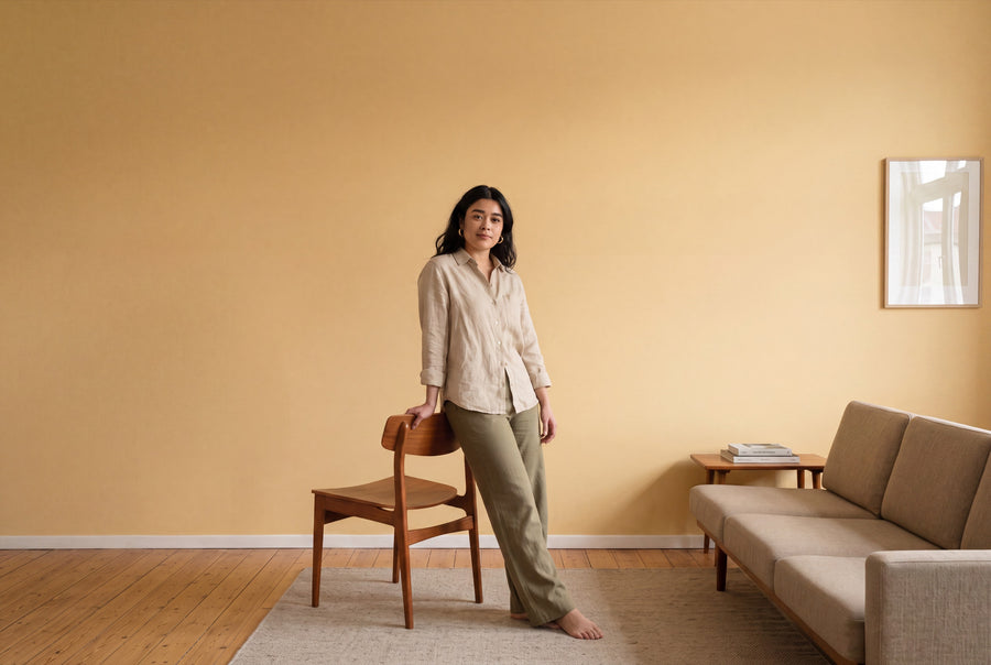
A north-facing room feels more awake with yellow on the wall than the daylight alone would suggest. Even a warm shade of yellow lifts a wall out of its dimness. That's why the yellow family here doesn't lean towards a signal colour, but towards linseed oil, candle wax and saffron.
Buy yellow wall paint: five shades from pastel to ochre
Five shades of yellow are available, plus the freely mixed special colour. All come in 2.5, 5 and 10 litre containers and in both finishes: matt as base one, silky matt as silk matte. What you pay depends on the litre count, not the finish.
Colours are tinted individually, only after your order comes in. The wall paints are water-based, low-emission and made in Germany; once payment is received, you'll have it within 3 to 5 working days within Germany. If your yellow isn't here, it can be made as a custom colour – individually mixed. And because hardly any colour reacts as strongly to artificial light as yellow, the Colour Sample Box, 65 pcs belongs before your purchase decision, not after it.
The five shades of yellow, from light to rich
Yellow that's almost white
Blanc Pêche No. 47 is the starting point: a white with a drop of peach added to it. On a large surface, it doesn't read as yellow but as warmth. That's exactly why it's the shade for people who want their walls brighter, but don't like a cold white.
Soft sunshine yellow
Soleil Doux No.45 is a muted daylight yellow, friendly and never garish. Candlewick Yellow No. 15 leans a touch towards wax, giving it an older feel, almost like a coat of paint that's already been on the wall for a few years. Both are the safe middle ground of the family: light enough for whole rooms, warm enough to rescue a north-facing one.
Saffron, ochre, amber
Here, yellow turns earthy. Saffron Glow No. 32 carries the orange note of a spice and is the boldest shade in the family. Soleil d'Ambre No. 46 sits alongside it like amber: deeper, calmer, with more brown in it. Shades like these don't need a whole flat, but they do deserve a wall or a niche of their own.
When no yellow quite fits
Five shades cover the range of yellow, but not every memory. If you're after a particular yellow from a fabric, a tile or an old coat of paint, the special mix is the way to go.
What yellow actually does in a room
Yellow is a bright, saturated colour, and that's where its effect comes from. A yellow room feels more awake, more open and larger than it is. That's an advantage as long as the amount is right: at full saturation across all four walls, cheerfulness quickly turns into restlessness.
Warm or cool comes down to yellow's neighbour on the colour wheel. If the tone leans towards orange, it turns warm and soft. If it leans towards green, it becomes cooler and clearer, and pairs better with grey.
Light exposure reinforces this. Facing north, yellow is almost always the right answer, because the cool, even light there desaturates every colour; a tone with an orange element holds up best against it. Facing south, some caution is needed: the sun already brings its own yellow, and a rich ochre yellow can turn harsh around midday. There, the lighter tones work better. In the evening, under warm artificial light, any yellow shifts a little further towards orange — pleasant in the living room, sometimes distracting in the study.
Where yellow belongs: kitchen, hallway, living room and children's room
Kitchen
The kitchen is yellow's natural home, since it's already the room where things are always happening. A warm sunny yellow on the wall above the tiles brings even a white kitchen unit to life. For a step-by-step guide, see Painting your kitchen: guide, costs, colour.
Hallway
Windowless hallways are the second place where yellow can do more than any other colour: it fakes daylight. Because space is tight there and every bag brushes the wall, the silk matte finish makes more sense than the matte one.
Living room
In the living room, yellow works best as a part, not the whole: one wall, one alcove, the area behind a shelf. An amber or ochre tone looks far more refined in the evening under lamplight than a pale pastel yellow, which then tends to slide into cream.
Children's room
For children's rooms, mid-tones are the sensible choice, not the bold ones. A rich yellow all around gets tiring over time, whereas a soft sunny yellow stays lively without becoming overwhelming. Here, the surface finish matters more than the tone — it should be wipeable.
Bedroom
In the bedroom, yellow works best kept very light. An off-white yellow with a hint of peach takes the chill off the wall without keeping the room too alert. Bold ochre tones are better suited to a single wall behind the headboard.
Surface first, then quantity
Both finishes are available in every yellow shade, and they change how the colour reads. base one, the matte interior paint, scatters the light and softens yellow's edge; it's the calmer choice for living and sleeping spaces. re-box silk matte WHITE (silk matte) is the silk matte version, especially hard-wearing and easy to clean, making it the right choice for kitchens, hallways and children's rooms. Both are low-emission, free from solvents and plasticisers, and tested for health-relevant ingredients.
On quantity: one litre covers approx. 6 to 8 m² per coat. For two coats, that means
- 2.5 l for approx. 8 to 10 m²,
- 5 l for approx. 15 to 20 m²,
- 10 l for approx. 30 to 40 m².
Over a dark or strongly coloured existing coat, consumption may increase; plan for more paint than the table suggests. All common, load-bearing interior surfaces can be painted, including plaster, wallpaper and old paint, provided they are clean, dry, sound and free of loose material. On fresh or highly absorbent plaster, a primer is worthwhile. And since yellow shows up every flaw along edges, Taping properly without paint bleed can help.
Matching partners for a yellow room
Yellow tolerates fewer neighbours than brown or grey, but the right ones hold firm. It's calmest with broken whites and sand tones, and most exciting with blue, its exact opposite on the colour wheel.
- Sand and linen as a base tone: Lin Clair No. 58 or Craie Ancienne No. 60 hold the room together without competing with the yellow.
- White for ceiling and trim: Blanc Épuré No. 55, if it should be crisp, Gesso Clair No. 57, if the transition can be softer.
- The big contrast: Harbour Blue No. 18 against an ochre yellow is the classic pairing of sun and water.
- Earthy companions: Olive Drift No. 7 and Bramblewood No. 6 share the same yellow undertone and so feel as if they belong to the same palette.
- An anchor in the dark: Forge Grey No. 28 on a single wall gives the yellow grounding and takes off its sweetness.
With wood: oak and pine intensify the yellow, while walnut and dark stains mute it. Brass works well alongside it, while polished chrome feels cold next to it.
Yellow as lacquer: furniture, doors, shelves
The same shade is also available as a lacquer. Under Yellow Lacquer Colours, the yellow family is available as re-box protect, a silk-gloss furniture and multi-surface lacquer in a 750 ml can for furniture, wood and interior surfaces. Wall paint and lacquer are two different materials, but the tone is the same.
A yellow lacquered chair or cabinet front against a sand-coloured wall is often a better idea than an entirely yellow wall. Before applying the lacquer, use re-box core as a bonding primer, followed by protect.
Frequently asked questions about yellow wall paint
Does a room with yellow wall paint look brighter?
Yes, light yellow shades make a room feel more awake and open. The effect is strongest with the palest tones and fades the more orange or brown a shade contains. That said, yellow can't make up for a lack of daylight.
Which yellow suits a room without windows?
A warm sunny yellow from the middle of the family, since it doesn't shift under artificial light. Very pale pastel yellows lose their colour under artificial light and end up looking simply creamy.
What changes if the wall was dark before?
Coverage drops, so plan for more paint. With very dark, strongly coloured or uneven surfaces, you may need noticeably more. An even, light-coloured base gives you a calmer result in the end.
How much paint do you need for a 10 m² kitchen wall?
The 2.5 l tin covers about 8 to 10 m² with two coats, so it's just enough. You can deduct window and door areas, while a dark base will use up more.
Can you paint a bedroom yellow without it feeling too intense?
Yes, if you stick to the palest tones. A whitish yellow reads as warmth rather than colour, while a saturated yellow all around a bedroom really can feel restless.
Does yellow look the same on screen as on the wall?
No, and with yellow the difference is bigger than with any other colour family. Screens show yellow more saturated than it actually reads on a matte wall. That's why it's worth testing a sample in your own room, viewed at two different times of day.
Is custom-mixed paint excluded from exchange?
Yes, all custom-mixed paints are excluded from withdrawal and exchange, because every tin is mixed only after you order it. Only specially marked white paint can be returned undamaged and in its original packaging.


