


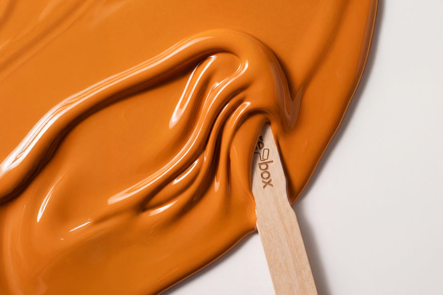
This category spans five yellow tones, from a white with a hint of peach kernel to a deep amber. Yellow is the range where sample and imagination diverge most easily. On a piece of furniture the tone usually works better than across a whole wall, simply because the surface stays contained.
Buy yellow furniture paint: five tones, one tin size, one sheen
Five yellow tones, all as re-box protect, our satin-sheen furniture and colour lacquer for furniture, wood and interior surfaces. It comes in one size, 750 ml, and one finish. So the only decision you actually need to make is the colour.
Every tin is mixed individually to order. That's why shipping takes 3 to 5 working days from receipt of payment, and why mixed paint is excluded from the right of withdrawal. With yellow, reaching for the Farbmusterbox 65 Stk beforehand is especially worthwhile: between screen, print and real light, yellow in particular shifts noticeably.
The five yellow tones in detail
The range runs from a tone you'd barely still call yellow to one that can carry an entire room.
Yellow that's almost white
Blanc Pêche No. 47 Lack is a white with a warm core. On a door you don't see yellow at all, just that the room feels friendlier than with pure white. This is the tone for anyone who wants warmth without wanting colour.
Soft, sunny yellow
Soleil Doux No. 45 Lack is muted sunlight, bright without being harsh, and works equally well on a chair, a stool or the inside of a cupboard. Candlewick Yellow No. 15 Lack carries more candle wax in its tone, a touch creamier and calmer. If you're torn between the two, let the light in the room decide: with little daylight, Candlewick Yellow wins; with plenty of sun, Soleil Doux does.
Deep saffron and amber yellow
Saffron Glow No. 32 Lack is the boldest yellow in the range, spicy with a distinct red undertone. Soleil d’Ambre No. 46 Lack pushes even further towards amber, sitting right at the border of the warm browns. Both are tones for a single piece, not for a whole wall of furniture.
How yellow shifts in daylight
Yellow is particularly sensitive to the colour of the light, because it sits so close to light itself. A tone that looks friendly in midday sun can turn slightly green under north light, and the same tone can appear almost orange under warm artificial light in the evening.
In practical terms: in north-facing rooms you need the creamier, slightly broken yellows, or the tone will turn dull. In south-facing rooms, use the deep yellows sparingly, because the sunlight only intensifies the saturation further. And because yellow reflects light, a painted surface casts colour onto its surroundings: a yellow cupboard door throws a faint glow onto the white wall beside it. That's not a flaw — it's exactly why yellow makes rooms feel larger and brighter.
Yellow furniture in four rooms
Kitchen
The kitchen is the natural home for yellow, since light, water and activity all come together there anyway. A front in Soleil Doux No. 45 turns a plain white standard kitchen into something distinctly your own, without you having to replace the units. For how to go about it and what it costs, see Küche streichen: Anleitung, Kosten, Farbe.
Living room
In the living room, yellow carries best on small pieces: a side table, a stool, a shelf. A sideboard entirely in Saffron Glow No. 32 is a statement that demands a very calm room around it. Yellow as the inside of an open shelf is the more elegant route, since the colour only reveals itself on closer look.
Children's room
Yellow works in a children's room as long as it isn't the harsh signal yellow of the toy shelf. Candlewick Yellow No. 15 on a shelf or a box stays friendly and wipes clean, because the lacquer is resistant to mechanical stress and everyday grime.
Hallway
Hallways rarely have windows, and almost never daylight from two sides. A yellow-lacquered door leaf does more there than any ceiling light. Blanc Pêche No. 47 is the cautious choice, Soleil d’Ambre No. 46 the bold one. For taping off the frame and fittings, see Tür lackieren ohne Ausbauen.
What works alongside yellow
Yellow needs a counterweight, or it quickly starts to read as nursery colour. That counterweight comes from grey, from brown, or from green.
- ✔️ A calm grey like Chalkstone No. 16 Lack on doors and skirting keeps a deep yellow in check without making it feel cold.
- ✔️ A dark brown like Brun Moka No. 53 Lack is the strongest partner for amber yellow, since both share the same warm base.
- ✔️ A muted green like Olive Drift No. 7 Lack paired with yellow gives you the combination found most often in nature, which is exactly why it rarely looks wrong.
- ✔️ In terms of materials, light woods, rattan, brass and terracotta are the natural neighbours. Chrome and high-gloss white, on the other hand, make yellow look cheap.
The same yellow tone for the wall
Each of these five names also exists as a wall paint. For yellow, that's a genuine option, because the effect changes with the surface: what feels cheerful on a chair can be too much across four walls, and what looks delicate on a wall almost disappears on a small piece of furniture.
You'll find the wall paints under Yellow. Directly comparable are Blanc Pêche No. 47 and Soleil Doux No.45 for bright rooms, Candlewick Yellow No. 15 for rooms with little daylight, and Saffron Glow No. 32 and Soleil d’Ambre No. 46 for a single bold wall. The shade is the same in both cases. The material isn't: wall paint and lacquer are two different products.
Surface, build-up and how much you need
With lacquer, you work in two steps: first re-box core as an adhesion primer, then protect in the yellow tone of your choice. The surface must be clean, dry, load-bearing and free of any loose material. With yellow, this preparation really pays off, because delicate yellow tones only turn out the way you saw them in the sample on an even, light-coloured base.
For the finish, you have a choice on the wall, but not on furniture. The lacquer is silky gloss. For the wall, there's re-box base one in matte and re-box silk matte in silky matte, the latter especially hard-wearing and very easy to clean. As a rough guide for the wall paint: 2.5 L is enough for approx. 8 to 10 m² with two coats, 5 L for approx. 15 to 20 m², 10 L for approx. 30 to 40 m². The lacquer comes in 750 ml, so measure your furniture surfaces individually.
Frequently asked questions about yellow lacquer colours
Which yellow doesn't look too bright?
Blanc Pêche No. 47 lacquer and Candlewick Yellow No. 15 lacquer are the two muted tones in the range and stay calm even on larger surfaces. Saffron Glow No. 32 lacquer and Soleil d’Ambre No. 46 lacquer are noticeably bolder and work better on a single piece of furniture than across a whole wardrobe front.
Why does my yellow look different in the hallway than in the kitchen?
Because yellow is sensitive to the colour of the light. North light pulls yellow tones towards green, warm artificial light towards orange. So check the tone with a sample at the actual location, not on the kitchen table.
Can I paint over a dark front with yellow lacquer?
Yes, but be sure to plan in the adhesion primer. re-box core goes on first, then the lacquer. It's on an even, light-coloured base that the delicate yellow tones in particular come out cleanest.
Does yellow lacquer go with oak?
Yes, especially the creamy tones. Candlewick Yellow No. 15 lacquer and light oak share the same warm undertone and don't clash. With amber yellows like Soleil d’Ambre No. 46 lacquer, you should keep some distance, otherwise the lacquer and the wood colour compete with each other.
Are the yellow tones also available as wall paint?
Yes, all five names are also available for the wall. There you choose between matte and silky matte, and between 2.5, 5 and 10 litres, while the lacquer only comes in a 750 ml container and in silky gloss.
How long does delivery take?
3 to 5 working days from receipt of payment, shipped within Germany. Processing only begins once payment has been received in full, because each tin is then mixed individually.


