


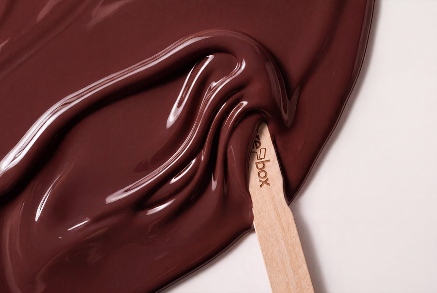
Red lacquer colours at re-box are never signal colours, but muted tones with depth. Seven are available, from a lightly washed linen with a red core to a velvety red that looks almost black when the light falls at an angle. What they share: they're warm without being loud.
Buy red furniture lacquer: seven shades from light linen to velvet red
This category holds seven red shades, each as re-box protect — the satin-gloss furniture and colour lacquer for furniture, wood and interior surfaces, in a 750-ml container. Mixed to order, not stocked in advance.
Red is the colour family where a screen helps least. Between a warm ochre-red and a berry tone lie worlds of difference in a room, but often only a few percentage points on a monitor. The colour sample box takes this uncertainty off your hands before a single tin is tinted.
And the same seven names are also available at re-box for the wall, in matt and in silk-matt. Furniture and wall are two different materials — the shade is the same.
How red works in a room
Red sits at the warm end of the colour wheel and appears to advance: a red front looks closer than it actually stands, making a large room feel cosier and a small one feel tighter. That's why red is often the smarter choice on furniture than on four walls — the colour is there, but it stays contained.
The grey content decides the volume. The earthy tones in this range have plenty of it and therefore appear calm; a clear red without any muting asserts itself instantly. The real choice lies between the two.
Red behaves differently to light tones when it comes to light. North light, which is bluish, cools red down and pushes it towards berry — Ochre Flame loses some of its warmth there, Berry Veil gains clarity. South light does the opposite: it brings the yellow content forward, so warm reds become noticeably more intense in the afternoon. Under artificial light, all seven tip towards the warmer side, dark tones most of all.
Seven red shades, sorted from light to deep
The light end of the family
Linen Wash No. 2 Lack is the lightest shade in the range: a warm, washed-out linen whose red core only becomes visible next to a neutral white. Château Rose No. 38 Lack is a notch stronger, sitting right on the border between dusty pink and red — on large fronts, it reads clearly as a colour.
Earthy reds with ochre
Ochre Flame No. 23 Lack has a distinct yellow content, which makes it look like fired earth rather than fire. Pimento Glow No. 34 Lack is spicier and a step closer to pure red, but keeps enough warmth to look at home on wooden furniture.
Clear, rich red
Crimson Éclat No. 43 Lack is the one shade in this category that holds nothing back: a clear, deep red with radiance. It sits well on a single door or a writing desk; on a whole run of kitchen units, it's a decision you make consciously.
Berry-toned and deep
Berry Veil No. 21 Lack pulls towards blue, making it look cooler and more modern than the earthy tones. Velours Shade No. 22 Lack is the darkest: a velvety, heavily darkened red that looks almost black in raking light and only reveals its colour in direct light.
Where a red lacquer belongs
Living room
A bookshelf in Velours Shade or a sideboard in Ochre Flame gives the room a focal point without the walls having to do anything. Red works best here as a single, large surface — spread across many small objects, it becomes restless.
Kitchen
Kitchen fronts in Pimento Glow or Château Rose look good against wooden worktops and brass, and hold up to use: the lacquer resists mechanical strain and everyday marks. For the steps involved, see Painting a kitchen: guide, costs, colour.
Hallway
In the hallway, red is a good idea, precisely because you don't linger there long. A door in Crimson Éclat between light walls acts like a preview of the rest of the home. For how to paint it without taking it off its hinges, see Painting a door without removing it.
Bedroom
Here, the muted tones count. Linen Wash on fitted wardrobes keeps the room calm, Velours Shade on a single piece of furniture gives it depth. A clear red, on the other hand, stays in view, even with the lights off.
What holds its own next to red
Red needs surfaces that ask for nothing. A light, slightly broken white on wall and ceiling is the simplest and most reliable partner — Blanc Épuré No. 55 Lack and Gesso Clair No. 57 Lack take on the same role on doors and frames when the furniture is red.
Lin Clair No. 58 Lack is the warmer of the two and pairs especially well with earthy reds, since both sit on the same side of the colour wheel. If you want a harder contrast, choose Forge Grey No. 28 Lack for plinths and handle rails, or Charbon Nuit No. 49 Lack for a true contrast — black against red is a classic pairing for good reason.
With woods: oak and pine share the warmth of the earthy tones and blend right in, while walnut and smoked oak give Crimson Éclat and Berry Veil the depth they can carry. Brass brings out the yellow undertone, while matte black fittings make any red feel more restrained. With textiles, linen, wool and undyed natural materials work better than glossy fabrics, which compete with the lacquer's silky sheen.
Red on the wall instead of the furniture
The name stays the same, only the material changes: around 65 shades exist twice at re-box, once as wall paint and once as lacquer. If you'd rather paint the wall than the front, you'll find the family under Wandfarben Rot. Two finishes are available there: the matte base one for walls and ceilings, and the silky silk matte, which is durable and very easy to clean.
For a tone-on-tone look, use the same name twice — for example Crimson Éclat No. 43 on the wall and the matching lacquer on the door in front of it. The difference in sheen stays visible, and that's the point: the matte wall absorbs light, while the lacquered surface reflects it back.
From sanding to the second coat
protect has a silky sheen — neither matte nor high-gloss. The surface must be clean, dry, stable and free of any loose material. On old furniture, that means sanding and dusting first, then applying re-box core as a primer, which adheres well to a wide range of surfaces. Only then does the lacquer go on, in two thin coats rather than one thick one.
With bold reds especially, careful masking pays off, since every bleed-through edge stands out immediately — you'll find the tricks for that in Richtig abkleben ohne Farbunterläufe. We don't give a blanket coverage figure per tin of lacquer: on furniture, consumption depends too much on edges, absorbency and the number of coats.
For the matching wall paint, we can give guide values: 2.5 litres for approx. 8–10 m², 5 litres for approx. 15–20 m², 10 litres for approx. 30–40 m² — each for two coats. On very dark, strongly coloured or uneven surfaces, consumption may be higher.
Frequently asked questions about red lacquer shades
Is Crimson Éclat No. 43 too bold for a whole kitchen run?
For a complete run, it's the boldest choice in the category. If you want the red without covering everything, paint the base cabinets in Crimson Éclat and keep the wall cabinets light — that gives the shade a surface to live on without filling the whole room.
Which red lacquer shade feels the calmest?
Linen Wash No. 2, as it's the lightest and most muted of all seven. Next comes Château Rose No. 38, which shows more colour but still stays subdued.
Will a light red shade cover a dark piece of furniture?
Only with the right prep. Sand the surface, remove the dust and apply core as a primer — otherwise the dark base will show through, and Linen Wash or Château Rose will need far more coats than planned.
What's the difference between Ochre Flame No. 23 and Pimento Glow No. 34?
Ochre Flame has more yellow and feels earthier, while Pimento Glow sits closer to a pure red. Side by side, Ochre Flame looks like scorched earth, Pimento Glow like paprika.
Does red work in a room with little daylight?
Yes, dark red shades actually work especially well there. Velours Shade and Berry Veil don't need sunlight to show their depth — under lamplight they feel warmer and richer than in daylight.
Can I return a mixed red shade?
No, custom-mixed paints are excluded from withdrawal and exchange. Since every tin is tinted only after you order it, the colour sample beforehand is the only way to check the shade first. Delivery within Germany takes 3–5 working days from receipt of payment.


