


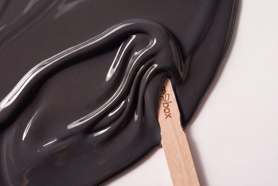
Grey doesn't force anything, and that's exactly its appeal. Fifteen shades are on offer in this category, from a grey barely distinguishable from white to an anthracite for doors meant to make a statement. In between lie the nuances that make all the difference.
Buy grey furniture lacquer: from chalk grey to anthracite
Grey is never neutral, however much it's called that. Every grey carries an undertone that warms or cools it, and that undertone decides whether a lacquered front works with the room or against it. This category sorts the selection so you see the undertone before you order.
Technically, it's straightforward: all shades are re-box protect, satin-gloss, in a 750 ml tin, for furniture, wood and interior surfaces. Mixing happens only after ordering, each tin individually. Two things follow from that, worth knowing in advance: delivery takes 3 to 5 working days from receipt of payment, and mixed paint is excluded from the right of withdrawal. If you're torn between three similar greys, order the Farbmusterbox 65 Stk first.
Five undertones, fifteen greys
Grey can't be sorted by lightness alone. The undertone decides, and the groups here are built around it.
Light grey, barely removed from white
Gesso Clair No. 57 Lack is the lightest in the range, a grey with a chalky character that reads almost like a warmer white on doors. Bone China Glow No. 12 Lack has something of porcelain about it, smooth and cool in impression. Wisp No. 4 Lack is the quietest of the three and suits rooms where furniture should recede, without turning everything white.
Warm grey with sand and stone
Chalkstone No. 16 Lack is the grey for anyone who usually finds grey too cold: a sandy undertone that looks right at home next to oak and linen. Stonecellar No. 17 Lack goes darker and earthier, bordering on taupe. Celadon Tide No. 3 Lack sits in the middle, a calm mid-grey that doesn't lean either way.
Grey with a touch of green
Everdell No. 5 Lack and Harbour Grey No. 31 Lack both carry a greenish core. That makes them the most companionable greys next to plants and natural wood. Everdell is the lighter one, Harbour Grey the richer shade, clearly visible on a kitchen front. Both feel calmer in north light than pure neutral greys, because the green takes the edge off the coolness.
Grey with a hint of blue
Brume Atlantique No. 40 Lack is mist over water, light and faintly blue. Bleu Faïence No. 64 Lack leans more clearly toward blue, already standing with one foot in the blue family. Harbour Blue No. 18 Lack is the boldest of the three. Blue-grey tones need warm materials alongside them, otherwise a north-facing room quickly turns cold.
Dark grey to anthracite
Velours Ombre No. 44 Lack is a soft dark grey without a hard edge. Forge Grey No. 28 Lack has more metal in the tone and looks almost like cast metal on furniture legs and handle rails. Nuit de Cendre No. 48 Lack is the darkest grey in the category, ash by night, and replaces black everywhere black would be too harsh.
What grey does to a room
Grey lives from its surroundings. Next to wood it looks warm, next to white severe, next to black soft. So the question is never whether a grey is beautiful, but whether it suits the light and materials in the room.
In north-facing rooms, the light stays cool and slightly blue. A blue-grey piece of furniture reinforces this and gives the room a matter-of-fact feel, while a sandy grey like Chalkstone No. 16 counters it. In south-facing rooms, the light turns warm, and the same front looks softer, sometimes almost beige. This is most visible with a satin-finish paint, because it reflects the incoming light rather than absorbing it. Dark grey adds depth on top of that: an anthracite door in a light wall acts like a frame and makes the passage look larger, not smaller.
Combining grey the right way
The most common disappointment with grey doesn't come from the shade itself, but from its neighbour: a warm grey next to a cool grey looks dirty. So stay within one undertone family and vary the lightness instead.
- ✔️ Warm greys with oak, walnut, linen, terracotta and brass.
- ✔️ Cool and blue-grey tones with ash, maple, steel, glass and light stone.
- ✔️ Add white, but choose it to match: warm grey calls for a broken white, cool grey for a clear one. Pure white next to sandy grey makes the grey look yellowed.
- ✔️ As an accent colour, grey tolerates almost anything. It stays calmest with muted green, and comes most alive with a warm yellow on a small surface.
- 👉 Three shades of grey in one room are two too many if they're similarly light. Aim for clear contrast: light, medium, dark.
Application, surface and container sizes
You work on furniture in two steps. First comes re-box core as an adhesion primer, then the paint. The surface needs to be clean, dry, load-bearing and free of loose particles, and the more even it is, the calmer a light grey will look in the end. Clean edges are especially important with grey, because the contrast with white reveals every irregularity. You'll find out how to get this right in Richtig abkleben ohne Farbunterläufe.
When it comes to finish, there's a difference between furniture and walls: the paint is satin-gloss, while for walls you choose between re-box base one in matt and re-box silk matte in satin-matt, which is especially hard-wearing and very easy to clean. The quantities differ too. The paint comes in 750 ml, the wall paint in 2,5, 5 and 10 litres. For walls, as a guide for two coats: 2,5 L for approx. 8 to 10 m², 5 L for approx. 15 to 20 m², 10 L for approx. 30 to 40 m².
Grey furniture and doors, room by room
Living room
A sideboard in Velours Ombre No. 44 gives a bright living room the calm counterpoint that textiles alone can't achieve. If you want something more subtle, just paint the skirting boards or a shelving frame in a mid grey.
Bedroom
In the bedroom, soft, slightly warm tones are the right choice. Chalkstone No. 16 on a nightstand and wardrobe doors stays muted and keeps the room light.
Kitchen
Kitchen fronts are the classic place for grey paint, because it's resistant to mechanical stress, everyday dirt and external influences. Mid grey tones like Harbour Grey No. 31 show splashes and fingerprints less than very light or very dark fronts.
Hallway
Doors in Nuit de Cendre No. 48 against light walls give a hallway structure and draw the eye forward. You can see how to work without removing the door in Tür lackieren ohne Ausbauen.
Study
Grey is the most understated backdrop for screen work. A desk frame or a mobile pedestal in Forge Grey No. 28 feels focused without making the room feel cold.
When walls and furniture share the same grey
Most of these shades are also available as wall paint, listed under Grau. For grey, this pairing is especially useful: a wall in Gesso Clair No. 57 with doors in the same tone makes a small room feel bigger, because no edge interrupts the eye. Conversely, a light wall with furniture in Nuit de Cendre No. 48 creates a clear, calm contrast.
The distinction in material still matters: wall paint and lacquer are two different products for two different jobs. The shade is identical, not the product behind it.
Frequently asked questions about grey paint colours
Why does my grey suddenly look blue?
Because the undertone of the shade interacts with the light in the room. Blue-grey shades like Brume Atlantique No. 40 Lack intensify cool north light, while sandy greys like Chalkstone No. 16 Lack soften it. That's why you should always check the sample in the spot where it will actually be used.
Which grey works with oak?
The warm, sand-based greys — Chalkstone No. 16 Lack, Stonecellar No. 17 Lack and Celadon Tide No. 3 Lack. They share the same yellowish base as oiled oak. Blue-greys next to oak can quickly look out of place.
Can I paint anthracite over a white furniture front?
Yes, with the right build-up. First re-box core as a bonding primer, then the paint. How many coats you need depends on the surface, so it's worth starting on a hidden spot.
Is grey paint wipeable?
re-box protect stands up to mechanical wear, everyday dirt and outside influences. That's why it's used on kitchen fronts, doors and stairs. Mid-tone greys forgive more in everyday use than very light ones.
How do the 15 grey shades differ from one another?
Mainly through undertone, not brightness. That's why the category is sorted by undertone: chalky-light, sandy-warm, greenish, bluish and anthracite. Within one of these groups, you'll almost always get the combination right.
Can I return a grey shade if it doesn't work out?
No, individually mixed paints are excluded from withdrawal and exchange. That's why the colour sample box is the safe way to go. Separately marked white goods can be returned as long as they're undamaged and in their original packaging.


