


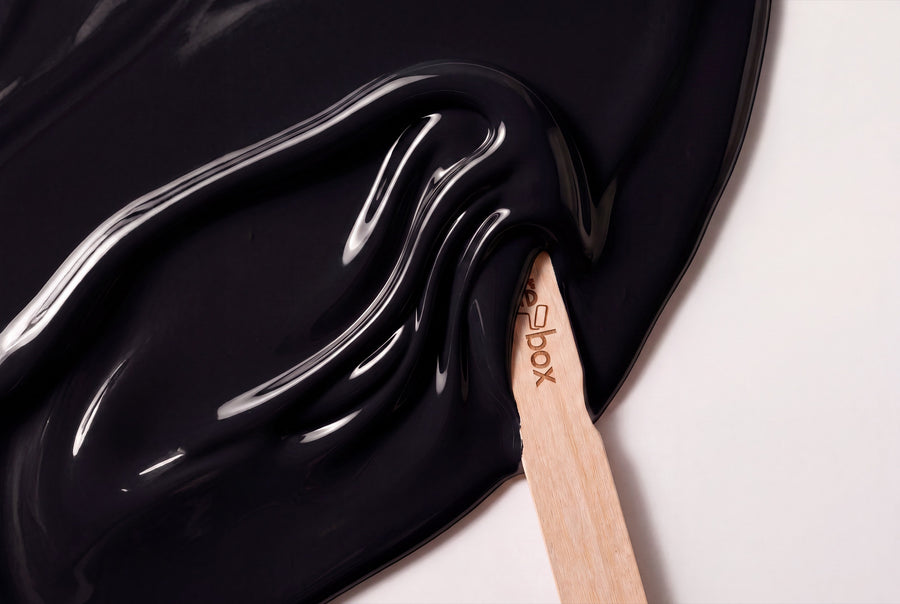
Between a smoky grey and a black that no longer gives back any light, you'll find six shades here. No two are quite the same black: one is lightened to a smoky haze, one leans into brown, one swallows the light completely. On furniture, it's exactly this distance that decides whether a surface feels hard or soft.
Buy black furniture paint: six shades from smoky grey to deep black
All six are re-box protect, the silk-gloss furniture and multi-purpose paint for furniture, wood and interior surfaces. It comes in a 750 ml tin, tinted only after you order.
With black, a sample really pays off, because the difference between two dark shades all but disappears on a screen, yet is instantly obvious in the room. The colour sample box holds 65 shades to try — hold them against the piece you want to paint, not against a white sheet of paper.
The same names are also available from re-box for the wall, there in matt and silky matt. Two different materials, but the same shade.
Six shades of black that aren't the same black
Smoky, lightened black
Brume Atlantique No. 40 Lack is the lightest shade in the range: a smoky grey with a cool core, one you only recognise as part of the black family once you compare it with a true grey. Forge Grey No. 28 Lack sits noticeably darker — a dense forge-grey that draws a clean line along doors and frames without turning them into a black border.
Anthracite with a hint of ash
Nuit de Cendre No. 48 Lack sits between grey and black, with a visible touch of ash that softens the surface. Gutter Black No. 33 Lack is the straightforward, unfussy black of the range: no blue cast, no brown cast, nothing to distract.
The deepest shades
Charbon Nuit No. 49 Lack is the richest black of the six — on a smooth front, you can barely make out where the edge runs. Bois Impérial No. 52 Lack, on the other hand, leans into brown and reads like very dark wood. It's the warmest of the six and the right pick if you don't want black to feel cold in the room.
What looks good next to black
Black needs a light counterpart, or the room turns into a cave. These four pairings work reliably every time:
- Clean whites: Blanc Épuré No. 55 Lack on the doors, black on the furniture — the classic, crisp cut. Neige Douce No. 42 Lack is the softer version, taking the edge off the contrast.
- Warm neutrals: Lin Clair No. 58 Lack lifts black out of the purely graphic. This pairing feels more natural in period buildings with stucco and floorboards than plain black and white.
- Grey as a middle step: Dove Horizon No. 26 Lack or Sel Marin No. 54 Lack build a bridge when the leap from black to white would feel too abrupt.
- One warm accent: Ochre Flame No. 23 Lack on a small piece of furniture next to black fronts — a room defined by black usually needs no more colour than that.
With wood, light contrast works best: oak, ash and birch keep their grain visible next to black. Walnut with Bois Impérial, on the other hand, creates a very enclosed, dark room — beautiful, but only with plenty of daylight. Brass warms up black surfaces, while brushed steel and matt black fittings give them a technical edge.
How much black a room can take
Black absorbs light. A black surface looks smaller and further back than it actually is — this can make a room feel deeper and, depending on where the surface sits, narrower at the same time. It works well on a single end wall or on built-in cupboards; on all four sides, rarely.
North light makes black feel even cooler and brings out the blue undertone in Brume Atlantique and Forge Grey. If you're working in a north-facing room and don't want a cold surface, choose Bois Impérial with its brown core. South light is less of an issue, since warm light softens dark shades anyway; in the evening under lamplight, all six read softer than in daylight.
With black, the silk sheen isn't a minor detail — it's the difference between a hole and a surface. Because a lacquered black front reflects the window, it stays visible as an object in the room. That's exactly what matt black walls lack, which is why black on furniture is usually the more rewarding choice.
Surface, build-up and sheen level
protect resists mechanical wear, everyday dirt and outside influences. The build-up is always the same:
- Clean the surface, sand it, then remove the dust. The substrate must be clean, dry, load-bearing and free of any loose particles.
- re-box core applied as a bonding primer. It adheres well to a wide range of surfaces. Only then does the paint go on.
- Apply the paint in two thin coats, not one thick one. With black, too thick a layer shows up every drip.
We don't give a fixed square-metre figure per paint tin — with furniture, coverage depends too much on edges, profiles and absorbency. For the wall paint in the same shade, however, there are guide values: 2.5 litres cover approx. 8–10 m² with two coats, 5 litres approx. 15–20 m², 10 litres approx. 30–40 m². For how to get a dark surface without patchiness, see Wände streichen ohne Streifen.
Black in each room
Living room
A built-in shelf or media wall in Charbon Nuit makes everything in front of it look larger. What matters is that enough light surface remains — otherwise the room loses depth instead of gaining it.
Kitchen
Black base units with light upper cabinets are the lowest-risk option. Gutter Black against wood and brass looks calm, while Bois Impérial suits warm stone worktops better.
Hallway
Doors in Forge Grey or Nuit de Cendre give a bright hallway structure without darkening it — that's the trick when black would be too much. For how to paint doors without unhanging them, see Tür lackieren ohne ausbauen.
Bedroom
Here, Bois Impérial is worth it. Its brown undertone takes the coldness out of the black, and a wardrobe in this shade reads more like dark wood than a black wall.
Stairs and staircase
A staircase in Brume Atlantique or Forge Grey copes better with signs of wear than a lighter shade. For the process, including the order of the steps, see Treppe streichen: Holztreppe Anleitung.
Black as a wall paint
Each of these paint shades has a matching wall shade of the same name — around 65 colour names at re-box exist in both. The wall version of this family can be found under Wandfarben Schwarz, available either as matte base one or as satin-matte silk matte, which is hard-wearing and very easy to clean.
On the wall, black behaves differently than on furniture: matte gives it a velvety look and softens the room's edges, while satin-matte keeps a hint of reflection. For a tone-on-tone look, use the same name twice — for example Gutter Black No. 33 on the wall and the matching paint on the door in front of it.
Frequently asked questions about black paint colours
Does black paint make a small room too dark?
Not if you limit black to furniture and doors rather than the walls. A black front against light walls gives a small room depth; it's only the fourth black surface that makes it feel cramped.
What's the difference between Charbon Nuit No. 49 and Gutter Black No. 33?
Charbon Nuit is the deeper, denser black, Gutter Black the more open one. Side by side, Gutter Black almost looks like a very dark anthracite — on its own in a room, both read as black.
Does every fingerprint show on black paint?
Satin-glossy dark surfaces show marks more readily than light or matte ones. protect is resistant to everyday dirt; anyone particularly sensitive to this should choose Forge Grey or Nuit de Cendre rather than the deepest black on handle edges.
Do I need to prime a door before applying black paint?
Yes, core is an essential first step. Without a bonding primer, the paint won't hold reliably on old paintwork or varnished wood, and this shows up first at the door edges.
Does black paint work with light oak?
Yes, that's the simplest combination in this category. The light grain of the wood stays visible next to black, while it quickly blurs next to grey. Bois Impérial is the option for anyone who wants less contrast.
Can I return a black paint shade?
No, individually mixed colours are excluded from withdrawal and exchange, because each tin is only tinted after the order is placed. So check the shade against a sample beforehand. Delivery takes 3–5 working days from receipt of payment within Germany.


