


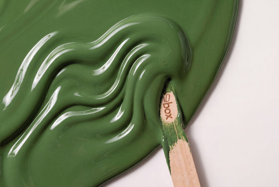
Green sits between blue and yellow, taking something from each side: it can be fresh or earthy, light or almost black. You'll find nineteen shades in this category. On furniture and doors, green looks calmer than on a wall, because the surface is smaller and the silk sheen breaks up the light.
Buy green furniture paint: 19 shades for furniture, doors and fronts
All shades in this category are re-box protect, the silk-sheen furniture and colour paint for furniture, wood and interior surfaces. One container, 750 ml, one sheen level. The only thing you choose is the shade — and here you have nineteen to pick from.
Every tin is mixed to order after you place it, not pulled off a shelf. That's why delivery takes 3 to 5 working days from receipt of payment, and why mixed paint is excluded from the right of withdrawal. With nineteen shades, some of them only a nuance apart, the Farbmusterbox 65 Stk is the obvious way to prepare.
Why green almost always works
You encounter green constantly outdoors, and that may be exactly why it rarely feels overpowering indoors. A green piece of furniture tends to look like something that's already been there a while.
The undertone decides the effect. Green with a yellow cast looks fresh and alert, and suits rooms that get little light. Green with a blue cast looks cool and clear and handles southern light well, because it balances out the warmth. Grey-green sits in between, changes the most over the course of the day, and is therefore the shade range you're most likely to misjudge without a sample. In north-facing rooms, the warmer, olive-leaning tones win out; in south-facing rooms, the cool, dark ones can hold their own.
Green and its neighbours
Green is uncomplicated, as long as the undertones match. An olive-leaning green next to a blue-leaning one looks like two attempts at hitting the same colour.
- ✔️ Natural wood works almost every time. Oak, pine and walnut suit every green in this range, because wood itself has a yellow-brown undertone.
- ✔️ Broken white on skirting boards and door frames lets dark greens stand out without isolating them. Pure white, on the other hand, makes sage look washed out.
- ✔️ Warm metals, linen, rattan and unglazed ceramics complement the earthy tones; steel and glass suit the cool ones.
- ✔️ As a contrast, warm brown works better than blue, because green and brown sit in the same colour space and don't undercut each other.
Nineteen greens, arranged by undertone
From a green you can barely sense to shades that look black in half-light. These five groups cover the whole family.
Green you can barely see
Wisp No. 4 Lack is the quietest shade in the range, a hint of green on a light base, ideal for the inside of cabinets. Vert d’Aube No. 62 Lack is morning green, also light, but with a clearly recognisable colour core.
Fresh green with a yellow touch
Matcha Bloom No. 9 Lack is the most alert green here, distinctly yellow-leaning and, surprisingly, quite understated on a small piece of furniture. Nice Breeze No. 36 Lack is lighter and airier, the green for rooms that should feel friendlier without looking colourful.
Sage and grey-green
This is the group most people mean when they say sage. Everdell No. 5 Lack is a light sage with a strong grey component and suits kitchen fronts as well as doors. Harbour Grey No. 31 Lack sits darker and calmer, right on the border between green and grey. Fjord Mist No. 39 Lack adds a cool, slightly blue cast and looks especially clear at a north-facing window.
Olive, moss and dry husks
Olive Drift No. 7 Lack is the classic olive, warm and muted, and a very reliable choice next to wood. Hearthstone Moss No. 8 Lack goes deeper into moss green. Green Husk No. 10 Lack is drier and slightly brownish, like a husk in late summer. Bramblewood No. 6 Lack has the strongest brown component and looks almost like forest floor. Canvas Cover No. 30 Lack sits at the edge of the family, forming the link to the earthy, linen-coloured tones.
Dark green to black-green
Gutter Black No. 33 Lack is so dark that the green only appears in direct light. Baltic Midnight No. 24 Lack leans towards blue-green and is the shade for a door meant to close off a room. Both need light-coloured neighbouring surfaces, otherwise the room swallows the shape of the furniture.
Green paint, room by room
Kitchen
There's a practical reason for choosing sage and olive tones on kitchen fronts: the paint is resistant to mechanical stress, everyday dirt and external influences, and mid-tone greens show less wear in daily life than white.
Living room
A dark green sideboard against a light wall is the calmest way to bring colour into the living room. If you want to start carefully, paint the back panel of an open shelf in Olive Drift No. 7 and leave the rest as it is.
Bedroom
Grey-green tones work best here, as they soften the light without darkening the room. A bedside table or chest of drawers in Fjord Mist No. 39 is usually all it takes.
Hallway and staircase
Doors, frames and stair strings in a deep green give a hallway a depth that white doors never achieve. For wooden staircases, it's worth taking a look at Treppe streichen: Holztreppe Anleitung beforehand.
Bathroom and guest WC
Small rooms handle bold tones better than most people think. A green lacquered vanity unit turns a functional bathroom into a room with intent, while the surface area stays manageable.
Bringing the same green onto the wall
Almost every name in this category also exists as a wall paint, gathered under Grün. The effect is especially worthwhile with sage: wall and built-in cupboard in the same tone make a room feel calmer and larger, because no colour edge stops the eye. Conversely, you can set a dark green piece of furniture against a light wall to emphasise the shape of the piece.
Before you tackle the wall, the surface needs to be right; the order of steps and the usual pitfalls are covered in Wände richtig vorbereiten. And once again, to be clear: it's the shade that matches, not the material. Wall paint and lacquer are two different products.
Sheen level, build-up and quantities
For furniture, the rule is: first re-box core as an adhesion primer, then protect in the green shade of your choice. The surface must be clean, dry, stable and free of loose particles. The lacquer is satin-glossy; there's no choice of sheen level here.
On the wall, however, you have two options: re-box base one in matt for calm, diffusing surfaces, and re-box silk matte in satin-matt, if the surface needs to be hard-wearing and very easy to clean. The quantities differ too. Lacquer comes in 750 ml, wall paint in 2.5, 5 and 10 litres. With two coats, 2.5 L covers approx. 8 to 10 m², 5 L approx. 15 to 20 m², and 10 L approx. 30 to 40 m².
Frequently asked questions about green lacquer colours
Which green is the sage you're looking for?
Everdell No. 5 lacquer comes closest to classic sage, light with a clear grey undertone. A touch darker sits Harbour Grey No. 31 lacquer, and cooler with more blue is Fjord Mist No. 39 lacquer. All three work equally well on kitchen fronts and doors.
Does green lacquer suit oak and pine?
Yes, this is the most reliable combination in this category. Wood has a yellow-brown undertone that pairs especially well with olive-leaning greens such as Olive Drift No. 7 lacquer. With very cool green shades, hold the sample right next to the wood before you order.
Will a dark green piece of furniture make the room feel smaller?
No, as long as the surface behind it stays light. Gutter Black No. 33 lacquer or Baltic Midnight No. 24 lacquer on a single piece of furniture act like an anchor in the room when set against a light wall. It only becomes tricky if the wall and the furniture are dark at the same time.
Can I apply green lacquer to a lacquered kitchen front?
Yes, provided the old coating is firmly bonded and the surface is clean, dry and stable. The build-up stays the same: re-box core as an adhesion primer, then re-box protect. Always remove the fronts and paint them lying flat, so the edges don't run.
How do I find the right one among nineteen shades of green?
Go by undertone rather than brightness. First decide whether you want it yellow-leaning, grey-green or blue-green, then compare only within that group. Use the colour sample box to check your final two candidates in daylight and under artificial light.
Are the green shades also available for walls?
Yes, most names in this category are also available as wall paint. There you can choose between matt and satin-matt, and between three container sizes, while the lacquer comes exclusively in satin-gloss in a 750 ml container.


