


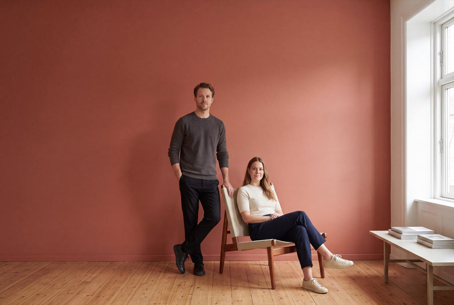
Many people shy away from red, underestimating how quickly it can transform a room. At re-box, the red family ranges from sandy nuances through burnt terracotta to wine red, which only reveals its depth in the evening light. Seven shades, each mixed individually to order.
Buy red wall paint: seven shades, matt or soft matt
This category features seven red wall paint shades, plus the freely mixable custom shade. All are available as re-box base one in matt or as re-box silk matte in soft matt, each in 2.5, 5 and 10 litres. Since the price depends only on quantity and not on finish, you choose the finish to suit the room, not the invoice.
The wall paints are made in Germany, water-based and low in emissions. Shipping is within Germany only and takes 3 to 5 working days from receipt of payment. With red, it's especially worth checking a real sample: hardly any colour family changes as much between the sample card and the finished wall. The colour sample box, 65 pcs takes this uncertainty away.
Five paths through the red family
Red isn't a single colour but a range — from sand with a red hint to wine red with a hint of brown. Seven shades feature in this category; neighbouring shades are marked as such.
Red that's still almost sand
If you want red without turning the room upside down, start here. Linen Wash No. 2 is very light with a warm red hint and works as an all-over colour in north-facing rooms. Château Rose No. 38 carries more colour but stays dusty and calm. Muted Rose No. 29 from the pink family is a shade more subdued still.
Terracotta, ochre, burnt earth
The earthy reds have yellow at their core and feel sunny rather than dramatic. Ochre Flame No. 23 is the classic burnt ochre to pair with terracotta tiles and rattan. Soleil d’Ambre No. 46, from a neighbouring family, sits lighter and carries large surfaces without darkening them.
Clear red at full strength
Two shades for anyone who wants red to be red. Crimson Éclat No. 43 is a rich, clear red — a colour for one wall, not four. Pimento Glow No. 34 has an orange undertone and feels warmer without losing any intensity.
Berry, blackberry, aubergine
As blue moves into red, the colour turns cooler and deeper. Berry Veil No. 21 is a berry-toned dark red that reads almost violet in artificial light. Its neighbour Bramblewood No. 6 leans into bramble tones. Aubergine Mist No. 20 belongs to the pink family and marks the violet edge.
Burgundy and dark velvet red
The dark reds need little wall space and plenty of light in the evening. Velours Shade No. 22 is a deep burgundy for dining and work rooms. Two neighbouring shades take it further: Velours Brun No. 50 carries more brown, Brun Moka No. 53 heads towards coffee and cocoa.
Not quite the right one?
If your red comes from a fabric or a rug, we'll mix it to match: Custom colour – mixed to order. If you're torn between two candidates, Anna, re-box's digital colour consultant, can help.
What red does to a room
Red has a strong sense of presence: a red wall seems to come towards you, making the room feel smaller but also more enclosed and warmer. In large, cool rooms that's an asset; in small, dark ones it's a risk. Rule of thumb: the more saturated the shade, the less wall space it can take.
The undertone decides whether a red feels warm or cool. Red with yellow — terracotta, ochre, pimento — feels sunny and open. Red with blue — berry, aubergine, burgundy — feels more formal and noticeably deeper in the evening.
North-facing rooms get cool, bluish light; it drains the glow from cool reds, while ochre and terracotta keep their warmth. South light pushes warm reds towards the intense at midday and lets the berry nuances bloom. Facing east or west, the tone visibly shifts through the day — testing it over a full day is worth it.
Red in the living room, dining room, bedroom, kitchen and hallway
Living room
A single red wall is almost always the better idea than four. The wall behind the sofa can carry a rich shade, while the rest stay light. Pay attention to where the evening lighting falls.
Dining room
Red is especially at home in the dining room. A burgundy or deep terracotta makes dinner gatherings feel warmer in the evening. It also works as an all-over colour, as long as the ceiling and trim stay a warm white.
Bedroom
Saturated red here is a matter of taste, but muted red is never a problem. A dusty rose-red on every wall, or a burgundy just behind the bed, brings calm rather than restlessness. In a matte finish, the tone feels softer.
Kitchen
In the kitchen, red pairs best with wood and natural stone. Near the stove and worktop, a silk matte finish makes sense since these areas get wiped down regularly. You'll find the right order of steps in Painting a kitchen: instructions, costs, colour.
Hallway
A red hallway works especially well when the space is naturally dark: instead of painting against the darkness, you embrace it. Clean edges are essential — find out how in How to tape off properly without bleeding.
Combining red the right way
Red needs a counterweight, or the room tips out of balance. The most reliable choice is a warm, broken white for ceiling and trim. A cold, pure white next to it makes terracotta look grey — the difference is bigger than you'd think.
- ✔️ Beige and sand — the calmest companion. A shade from the Beige family lets red stand out as an accent.
- ✔️ Green — olive and sage are the classic counterpart to terracotta.
- ✔️ Wood — walnut and dark-oiled oak with burgundy, light pine with ochre.
- ✔️ Natural stone and brick — they pick up the undertone without repeating it.
- ✔️ Brass and leather — they support the earthiness, while chrome and glass work against it.
Matte or silk matte, and how much paint to calculate
With red, the finish is no small detail. re-box base one in matte scatters the light, so the surface looks deeper and more velvety, and small imperfections disappear — usually the more flattering choice for rich reds. re-box silk matte is especially hard-wearing and very easy to clean, but reflects more light and lets the tone appear clearer.
- 👉 2.5 litres — approx. 8–10 m² with two coats, for an accent wall.
- 👉 5 litres — approx. 15–20 m² with two coats, for a small room.
- 👉 10 litres — approx. 30–40 m² with two coats, for four walls.
Strong reds applied over dark or uneven previous coats need more paint than the table suggests. The surface must be clean, dry, stable and free of loose material; plastered walls, wallpaper and sound old paintwork are all suitable. On highly absorbent or fresh plaster, a primer is worthwhile. A strong colour only goes on streak-free with the right technique — find it in Painting walls without streaks.
Red as a lacquer for doors, furniture and shelves
The same shade isn't limited to walls: under Lackfarben Rot you'll find the red tones as re-box protect, the furniture and multi-purpose lacquer in a 750 ml tin. The lacquer has a silky sheen and stands up to mechanical wear, everyday marks and outside influences.
These are two materials for two jobs; only the colour stays the same. Building up on wood starts with the primer re-box core and finishes with protect.
Common questions about red wall paint
Is a whole red wall too much?
A single wall in a rich red is the right dose in almost any living space. Four red walls work where the tone is muted — terracotta, wine red, dusty rose-red — and the ceiling stays light. With a clear red like Crimson Éclat No. 43, it's best to stick to an accent wall.
Which red suits terracotta tiles?
Ochre Flame No. 23 and Soleil d'Ambre No. 46 pick up the yellow-tinged undertone of fired clay and read as one piece with it. Berry and wine-red tones, on the other hand, end up competing with the floor. Hold a sample directly next to a tile.
Does red cover worse than light colours?
On very dark, strongly coloured or uneven surfaces, consumption can go up, and this affects bold reds in particular. Plan for two full coats and choose the next size up. A primer on absorbent plaster helps as well.
How much red wall paint do I need for a wall of 4 x 2.60 metres?
This wall is around 10.4 m², which is at the upper end of what 2.5 litres manages over two coats (approx. 8–10 m²) — so it's safer to plan for 5 litres. Wall area is width times height, minus windows and doors.
Does red look different under artificial light?
Yes, noticeably so. Warm artificial light makes terracotta richer and gives wine red a more velvety look, while cool LED light pulls the same tones towards brown. So check your sample in the evening with the lights on too.
Are the reds also available as lacquer?
Yes, in the Lackfarben Rot category as re-box protect in 750 ml. The shade is the same as the wall paint, the material different — protect is a silky-sheen furniture and multi-purpose lacquer. Before lacquering, the primer re-box core goes onto the surface.
Can I return a mixed red shade?
No, custom-mixed paints are excluded from withdrawal and returns. Since every shade in this category is only mixed after ordering, this applies to all the reds. Order a sample beforehand, so the decision is made before mixing.


