


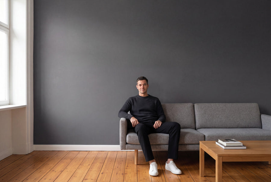
Between an almost white lime grey and a deep anthracite lie 18 gradations. The difference between two neighbouring ones is often bigger on the wall than it looks on screen. Grey is therefore the family where a sample on your own wall pays off the most.
Buying grey wall paint: what's in this family
Eighteen shades of grey make up the range, from the lightest lime tone to the darkest ash grey. Each shade is available in 2.5, 5 and 10 litres, either matte as base one or soft-matte as silk matte. The price depends on the size, not the finish.
Mixing happens individually, once your order has come in. All wall paints are water-based, low-emission and made in Germany. Delivery takes 3 to 5 working days from receipt of payment within Germany. If your grey isn't among them, we'll mix it as a Wunschfarbe – individuell angemischt. With such a densely populated family, though, the Farbmusterbox 65 Stk is the smarter first order: two greys side by side on your own wall answer the question in five minutes.
Grey is never neutral, it always has a direction
A common misconception about grey: that it has no colour. Every grey carries an undertone, and that decides how the room feels. A grey with red or yellow content turns into greige and feels soft like linen. A grey with blue or green content feels clear and cool, closer to concrete than to fabric.
That's why it's worth searching not for light or dark first, but for direction. If you have warm wood, brass and wool in the room, you'll get further with a warm grey. If you like steel, glass and clean edges, go for a cool one.
The light adds another layer on top of that. North-facing rooms get cool, even light: there, a blue-tinged grey quickly turns hard and cold, while a warm greige stays liveable. South-facing rooms get warm light, which can warm a greige further and push it towards beige; there, a cooler grey carries the surface better. In east- and west-facing rooms the effect shifts over the course of the day, and that's exactly where a well-chosen grey sets itself apart from a mediocre one.
The shades of grey sorted by undertone
Almost white grey
Gesso Clair No. 57 is the lightest of the group, a chalky grey-white that allows ceilings and walls in a single tone. Wisp No. 4 has a bit more substance and still reads as white, as long as nothing whiter sits next to it. Bone China Glow No. 12 leans minimally warm, Pierre Douce No. 41 minimally stony. These four are the answer for a white that shouldn't feel cold.
Warm greige and stone grey
Here, the red and yellow undertones take the lead. Chalkstone No. 16 is the classic greige, medium-light and at home in almost any room. Loom Spirit No. 14 feels more textile, as if someone had stretched linen across the wall. Stonecellar No. 17 goes furthest towards brown and is the bridge to the beige side of the range.
Cool grey with a blue pull
Brume Atlantique No. 40 is the misty shade of the family, light with a subtle blue cast. Fjord Mist No. 39 sits a notch stronger beside it, showing its blue undertone clearly in daylight. Both need warm materials in the room, or things start to feel clinical.
Grey with a green or violet shimmer
The most intriguing corner of the range. Everdell No. 5 and Harbour Grey No. 31 have a green core that gives them a soft, natural feel without reading as green. Aubergine Mist No. 20 goes the other way: a grey with a violet veil that looks its best in the evening under artificial light.
Dark grey to anthracite
Forge Grey No. 28 is the classic forge grey, strong but not yet black. Velours Ombre No. 44 feels velvety and deep. Nuit de Cendre No. 48 is the darkest shade in the family, turning a wall into a surface that everything else stands in front of. Dark greys forgive no uneven surface, so the wall needs to be properly prepped before painting: Preparing walls the right way: how to make your DIY project stress-free.
What looks good next to grey
Grey is a good listener: it takes on whatever stands beside it. Warm natural materials such as oak, rattan, wool and leather turn a cool grey into a welcoming room. Metal, glass and exposed concrete, on the other hand, sharpen its clean, understated side.
White is where it's decided whether the whole thing works. A pure, cold white next to a warm greige makes the greige look dirty. For ceiling and skirting boards, choose a shade that matches the undertone instead, or stay within the family and carry the lightest grey upward. Two neighbouring greys on wall and ceiling are almost always more elegant than grey against pure white.
As a second colour, muted tones work better than bold ones. An olive green or a deep blue on a single wall gives the room the point where the eye comes to rest.
matte or silk matte, and how much paint to calculate
base one is the matte interior paint for walls and ceilings. On grey surfaces, it's usually the right choice, because the matte finish diffuses light so the shade appears deep and even. silk matte is silky matte, especially hard-wearing and very easy to clean; it belongs anywhere hands, bags and shoes come into contact with the wall. Both are low-emission, free from solvents and plasticisers, and tested for health-relevant substances.
As a rule of thumb, one litre covers about 6 to 8 m² per coat. For two coats, that means:
- 2,5 litres: approx. 8 to 10 m²
- 5 litres: approx. 15 to 20 m²
- 10 litres: approx. 30 to 40 m²
All common, load-bearing interior surfaces are suitable, including plaster, wallpaper and old coats of paint. They need to be clean, dry, stable and free of any loose material. On fresh or highly absorbent plaster, a primer is recommended, since the surface then dries more evenly and absorbs less paint. If the old wallpaper needs to come off first, Removing wallpaper the right way can help.
Room by room: working, living, sleeping, kitchen, hallway
Home office
For the desk, a medium-light, slightly cool grey is a good choice: it doesn't glare, it doesn't distract, and screens sit in front of it without a colour cast. Warm greige tones tend to feel too cosy here.
Living room
In the living room, the furniture decides. Light wood and textiles pair well with a warm greige, while dark wood and clean shapes call for a cooler grey. A dark grey wall behind the sofa feels calmer than four light walls, but it needs good lighting in the evening.
Bedroom
Grey is the calmest solution for the bedroom, because it carries no signal effect. Shades with a green or violet core feel softer here than pure neutral greys, taking the harshness off the wall without turning colourful.
Kitchen
In the kitchen, grey draws attention away from the wall and onto the cabinet fronts and worktop, which is almost always the right effect. Above the worktop, the silk matte finish is the more practical choice, since it wipes clean of grease splashes more easily.
Hallway and staircase
Hallways can take a darker grey than you'd expect, as long as doors and skirting boards stay light. The contrast gives the narrow space a sense of order. Since this is where daily knocks and bumps happen, silk matte is the recommendation here too.
When the door gets the same shade as the wall
Wall paint and lacquer are different materials, but you can get the same shade for both. In Lackfarben Grau, the grey family is available as re-box protect, the silky-gloss furniture and multi-purpose lacquer in a 750 ml can, for furniture, wood and interior surfaces.
The classic look is a grey door against a grey wall, one shade darker than the surrounding surface. It's built up in two steps: first re-box core as a primer, then protect.
Common questions about grey wall paint
How can I tell if a grey is warm or cool?
Hold the sample next to a sheet of white paper. Warm greys will show a yellowish or reddish undertone, cool ones a bluish or greenish one. Out in open space with nothing to compare it to, almost any grey looks neutral.
Which grey suits a north-facing room?
A grey with a warm undertone, in other words a greige. North light is cool to begin with and intensifies any blue in the wall colour, so a cool grey can quickly feel harsh there.
How much grey wall paint do I need for a room with 35 m² of wall area?
The 10-litre tin covers approx. 30 to 40 m² with two coats, so it's enough. With a dark anthracite over a light surface, it's worth planning for a little extra.
Does a dark grey feel oppressive in a small room?
Not necessarily — the ceiling is what matters most. If it stays light and the skirting boards and doors are set apart in a different tone, the room gains depth instead of feeling cramped. It only starts to feel tight once all six surfaces are dark.
How do I tell two similar greys apart before buying?
Place them side by side on the same wall, in daylight and in the evening. Two shades that are barely distinguishable in the shop often look clearly different on a wall with north light. That's exactly what the colour sample box is for.
Can I paint the wall and ceiling in the same shade of grey?
Yes, and with the lighter tones in this family it's actually the calmest solution. The ceiling will look slightly darker anyway, due to the different light falling on it.
Are mixed grey shades excluded from exchange?
Yes, individually mixed paints are excluded from withdrawal and exchange. Every bucket is made only after the order is placed. Separately marked white goods can be returned undamaged and in their original packaging.


