


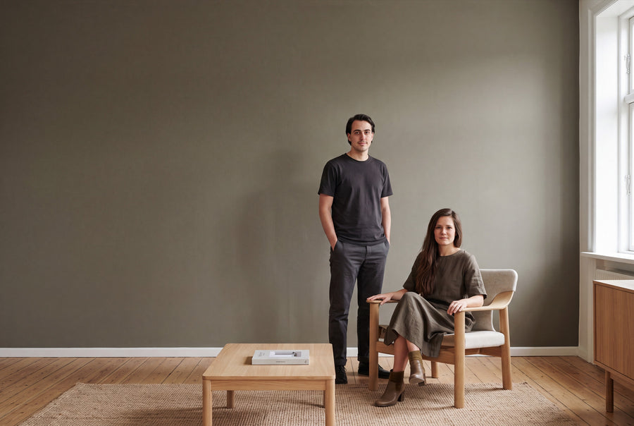
Brown grounds a room without weighing it down. The tone is built from red, yellow and a touch of black, which puts it closer to wood, leather and linen than any pure colour. At re-box, the brown family ranges from chalky taupe to dark cocoa.
Buy brown wall paint: ten earth tones in the range
The family spans ten shades of brown, from pale limewash brown to an almost-black night brown. Every tone comes in 2.5, 5 and 10 litres and in two finishes: matt as base one or soft-sheen as silk matte. The price depends only on the quantity — the finish costs nothing extra.
Every tin is mixed to order once you've placed it. The wall paints are water-based, low in emissions and made in Germany. Once payment is received, delivery takes 3 to 5 working days within Germany.
If the one shade you have in mind isn't in the range, order it as a custom colour – mixed to your specification. And since brown almost always looks different on screen than on the wall, it's worth getting the colour sample box, 65 pcs first: every shade as a sample, so you can compare them in your own light.
Why brown stays calm even in low light
Brown is a mixed tone, and that's where its composure comes from. It has no sharp edge for the eye to catch on, and it reads calmer day to day than a rich, pure colour. Rooms in brown feel lived-in rather than freshly decorated.
Whether a brown feels warm or cool comes down to its red content. Tones with plenty of red and yellow draw a room in and make it feel cosy. Tones with a grey or green undertone — the taupe side of the family — keep their distance and read more like stone than wood.
Light shifts both. A north-facing room gets even, slightly blue-tinged light: cool taupe tones lose their brown depth there and can tip flat, while a tone with an ochre core holds its ground. South-facing rooms bring warm light that heats up every brown further. There, a cooler-leaning tone is the safer choice, or the wall can slide into orange. East- and west-facing rooms are the trickiest: cool in the morning, warm in the evening. That's exactly where a sample you view at two different times of day earns its keep.
From lime to cocoa: the shades in detail
Pale taupe and lime brown
The lightest part of the family is also the easiest to place. Craie Ancienne No. 60 has the chalky character of old limewash and reads more like a warm off-white with a brown core. Canvas Cover No. 30 leans toward unbleached linen. Stonecellar No. 17 sits between the two — a brown with a noticeable grey undertone that looks just as good in a hallway as in a bathroom.
Warm wood brown
This is the brown everyone pictures when they think of brown. Chêne Antique No. 51 echoes old oak wood, calm and with a visible yellow undertone. Hippo Shade No. 19 is a shade greyer and dustier, a brown with a muted centre that carries a whole room rather than just an accent wall.
Brown with a red core
As the red content rises, brown turns sociable. Berry Veil No. 21 has a berry undertone that comes through clearly under artificial light and warms up living rooms in the evening. Velours Brun No. 50 is more velvety and darker, a tone for a wall that carries something: pictures, shelves, brass.
Deep cocoa and night brown
The dark side. Brun Moka No. 53 is the classic coffee tone, dark but still clearly brown. Bois Impérial No. 52 leans toward tobacco and, across large surfaces, reads almost like veneered wood. Charbon Nuit No. 49 sits at the end of the scale, a brown-black that only reveals its colour core in raking light. Dark tones call for an even base and a clean second coat.
What brown pairs well with
Brown is an easy partner, since it's already made up of several colours itself. It works with the least effort alongside materials from the same family: oak, walnut, rattan, linen, unpolished leather, terracotta. Cold, high-gloss surfaces can feel out of place next to it, while brushed brass looks like it belongs.
- White as a counterpoint: Blanc Épuré No. 55 for ceilings and window reveals, when you want a clear contrast.
- A softer transition: Lait Vanillé No. 56 or Lin Clair No. 58, when the wall should fade out rather than cut off.
- Green as a second colour: Olive Drift No. 7 shares its yellow undertone with the wood browns and stays within the same mood.
A pure, cool white right next to a warm brown often makes the brown look dingy. To avoid this, choose a white with a hint of warmth for the ceiling.
Brown in the living room, bedroom, kitchen and hallway
Living room
In the living room, brown carries whole walls, not just niches. A mid-toned wood brown behind the sofa gives the seating area a sense of purpose and, by lamplight in the evening, does exactly what brown does best. In a small room, keep the ceiling light.
Bedroom
This is a place where it's fine to go darker than you might first dare. A deep cocoa around the bed absorbs light and makes the room feel more enclosed in the evening, which tends to help rather than hinder falling asleep. In the morning, a room like this needs good lighting.
Kitchen
In the kitchen, the light taupe tones are the safer route, especially above the worktop. If you have a wood front, avoid matching the wall colour to the same brown level: going one or two shades lighter or darker gives both surfaces their definition back.
Hallway and staircase
Hallways rarely get daylight and handle colour better than white walls, which tend to look grey there. A brown with a red undertone turns the passageway into a room of its own. Since this is a spot that takes constant knocks, the silk matte finish is the more sensible choice.
Study
Brown keeps the eye calm without making it drowsy. For the desk area, a muted, grey-toned brown works better than a red-toned one, since it feels less heavy on the room during screen work.
matte or silk matte, and how much you need
Both finishes are available in every brown shade. base one is the matte interior paint for walls and ceilings: it absorbs light, calms the surface and makes dark tones look especially deep. silk matte is the silky variant, particularly hard-wearing and very easy to clean. Both are low-emission, free from solvents and plasticisers, and tested for health-relevant substances.
Rule of thumb: matte where the wall should mainly look good, silk matte where it needs to hold up to more. One litre covers approx. 6 to 8 m² per coat. With two coats, that works out to:
- 2.5 L for approx. 8 to 10 m²
- 5 L for approx. 15 to 20 m²
- 10 L for approx. 30 to 40 m²
On very dark or uneven surfaces, consumption increases. For a clean way to work out your area, see the article Wie viel Wandfarbe brauche ich? Farbverbrauch berechnen. All common, load-bearing interior surfaces are suitable: plaster, wallpaper and existing old coats of paint. The surface must be clean, dry, load-bearing and free of loose material. Priming isn't essential, but it's advisable on highly absorbent or fresh plaster. For surfaces without visible edges, see Wände streichen ohne Streifen: Profi-Tricks für perfekte Ergebnisse.
The same brown shade for doors and furniture
Wall paint and lacquer are two different materials, but the same shade is available for both. Under Lackfarben Braun you'll find the brown family as re-box protect, the silky-gloss furniture and multi-purpose lacquer in a 750 ml tin. With it, you can bring door panels, frames, shelves or a chest of drawers to the exact same tone as the wall.
For lacquer, the order matters: first re-box core as an adhesion primer, then protect. If you'd rather put a shade just one step off the wall colour onto furniture, choose the neighbouring tone from the same shade group.
Frequently asked questions about brown wall paint
Which brown suits a north-facing room?
Choose a brown with a visible red or yellow undertone, such as a wood brown. Northern light is cool and draws the warmth out of grey-toned taupe shades, making them look flat. A warm core balances that out.
Does a small room look even smaller with dark brown?
It feels more enclosed, but not necessarily narrower. Dark walls soften the corners, so the boundaries of the room become less distinct. It only becomes an issue once ceiling, wall and floor all share the same depth of colour.
How much brown wall paint do I need for 20 m² of wall area?
For approx. 15 to 20 m² with two coats, the 5-litre tin is enough. With a dark shade over a light surface, it's best to calculate generously, since strong colour contrasts increase consumption.
Is taupe a brown or a grey?
Taupe is a brown with a high grey content, which is why it belongs in this family. Depending on the light, it can read warmer or cooler. Next to a true grey, the brown core is instantly recognisable.
Can I test a brown shade on my own wall first?
Yes, that's what the colour sample box is for, with all shades available as samples. Hold two candidates up side by side on the wall they're intended for, and look at them in daylight and under lamp light.
Can I return custom-tinted paint?
No, individually mixed paints are excluded from withdrawal and exchange. Every bucket is mixed only after the order is placed. Separately marked white goods in their original condition are exempt from this.


