


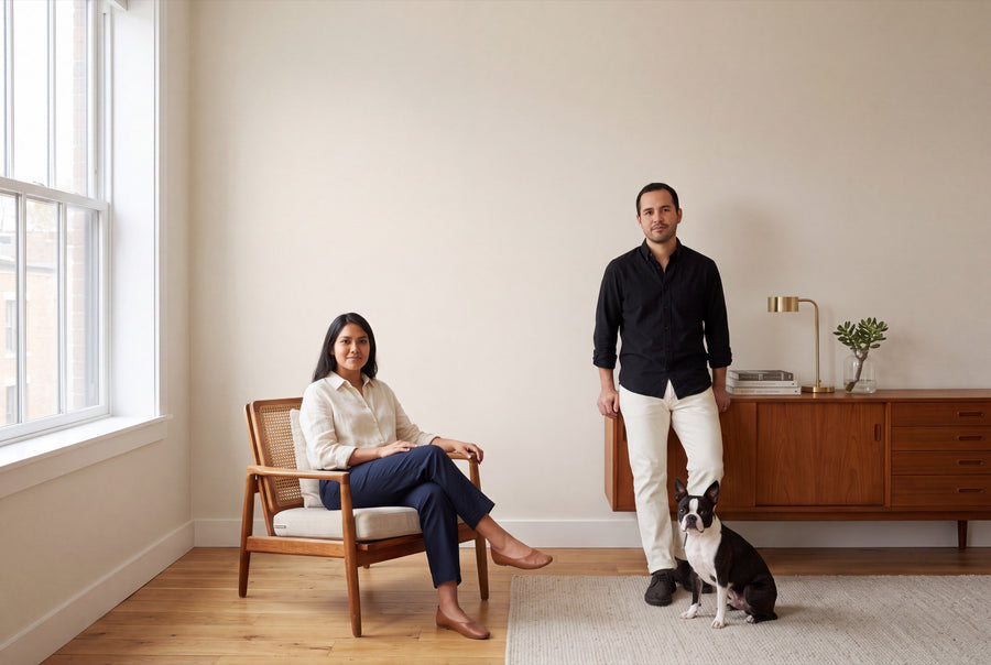
Beige is the colour you only notice once it's gone. It holds a room together without pushing itself into the foreground, and it supports every piece of furniture that comes along later. At re-box, you'll find 17 shades of beige — from almost white to a greige that turns almost brown in evening light.
Buy beige wall paint: 17 shades, matt or satin matt
Every one of these shades is mixed only once you order, in the quantity and finish you choose: 2.5, 5 or 10 litres, matt or satin matt. The finish costs nothing extra — it simply depends on what the room needs to withstand. If you can't find your exact nuance, we'll mix it as a Custom Colour – Individually Mixed.
Beige has one practical advantage: it's the shade you can use to paint an entire home without every room looking the same. Two neighbouring tones from this palette placed side by side read like a gradient, not two separate decisions.
Sand, linen, chalk: the nuances in detail
Almost white, but warm
The lightest group is for ceilings, small rooms, and anyone who finds plain white too cold. Blanc Épuré No. 55 is the crisp, clear white with a touch of warmth. Neige Douce No. 42 sits just a shade softer beside it, and Wisp No. 4 is the most delicate veil of them all — over a large surface, more a mood than a colour.
Cream and vanilla
Here, a touch of yellow comes into play, bringing a sense of sunlight into the room. Lait Vanillé No. 56 is the creamiest tone in the family. Cashmere Dune No. 1 and Lin Clair No. 58 stay lighter and calmer; both are good base tones for an entire floor.
Linen and chalk
The papery, slightly chalky beige tones. Linen Wash No. 2 and Linen Veil No. 11 recall unbleached fabric, while Craie Ancienne No. 60 and Chalkstone No. 16 evoke lime and old plaster. This character comes through most clearly in matt, since the surface reflects no light.
Beige with a hint of rosé
Soie Blush No. 59 and Blanc Pêche No. 47 have a warm, slightly rosy undertone. That's the trick for north-facing rooms: the pink content absorbs the cool light without the wall actually looking pink.
Sand, stone and greige
The darker half. Pierre Douce No. 41 and Sel Marin No. 54 carry a touch of grey and so feel more sober, Canvas Cover No. 30 sits close in tone to unbleached sailcloth. Stonecellar No. 17 and Hippo Shade No. 19 are the boldest shades in the family and can carry an entire wall on their own.
Why beige feels calming, and when it tips over
Beige sits, in colour terms, between earth and sunlight. It has no pull in any one direction, which lets everything else in the room stand out more: wood, textiles, artwork. That's why it's such a natural choice for rooms where you want to unwind or focus.
It can tip in two directions. In south-facing rooms, the warm afternoon light intensifies the yellow undertone, and a creamy shade can suddenly look like dated wallpaper paint — there, the shades with a grey or pink undertone are the safer choice. In north-facing rooms, the opposite happens: the cool, even light pulls out the grey undertone, and greige turns into a tired mouse grey. There, reach for the warmer cream tones instead.
Second point: artificial light. Warm-white bulbs push every beige further towards yellow. If you switch on a lot of light in the evening, be sure to check your sample with the lamp on too, not just in daylight.
Combining beige: wood, linen and the right white
Beige gets along with almost everything, but some pairings work especially well. Oak and light ash sit very close in tone to the cream shades and blend right in with them. Walnut and darker furniture, on the other hand, need the bolder sand tones as a counterweight, otherwise the wall looks washed out. Linen, wool and undyed cotton are the natural fabric choices — they share the same slightly irregular character as the chalky tones.
For doors, windows and skirting, it's best to pick a white with the same warmth as the wall, not the coolest one you can find. That way, the contrast stays soft, and the wall doesn't end up looking like a yellowed old coat of paint. If you're after more tension, place beige next to a deep brown or a muted green: both families sit close enough to work together, and far enough apart to stand out.
Beige, room by room
Living room
The classic choice, because beige moves with the seasons: light and airy in summer, warm in winter. A matt finish keeps large wall surfaces looking calmer and is forgiving of small imperfections in old plaster.
Bedroom
Here it pays to go one shade darker than you'd first think. A rich sand or greige takes the edge off the room and makes it feel calm the moment evening falls — especially if the ceiling is painted in the lightest shade of the family.
Kitchen
Beige next to wood-fronted units is one of the most understated pairings there is. Since grease, steam and fingerprints come with the territory here, go for satin matt. For a step-by-step approach to painting a kitchen, see Küche streichen: Anleitung, Kosten, Farbe.
Hallway
A warm beige tone is worth more in a windowless hallway than any white: it bounces the light from your lamps back more kindly. Expect a lot of contact on the walls — jackets, bags, small hands — so choose the satin matt finish here too.
Study
Beige doesn't distract, which counts for a lot when you're working from home. A light chalky tone behind the screen stays calmer than pure white, which can look harsh in daylight.
Matt or satin matt, and how much beige you'll need per tin
Matt is the right choice for living rooms, bedrooms and studies: the surface stays calm, raking light is absorbed, and the tone reads deeper. Satin matt belongs in the kitchen, bathroom, hallway and children's room, since it's especially hard-wearing and very easy to clean. Both finishes are available in every beige shade, and the price depends only on the quantity.
On coverage, always calculated for two coats: 2.5 l is enough for approx. 8–10 m², 5 l for approx. 15–20 m² and 10 l for approx. 30–40 m². On very dark, strongly coloured or uneven surfaces, consumption can be higher. Over a bold existing coat of paint, it's worth planning a little extra when using light beige tones.
Before you start, one thing matters most: the surface must be clean, dry, stable and free of any loose material. On fresh or highly absorbent plaster, a primer is worthwhile, as the paint then dries more evenly. For a step-by-step guide to preparing and checking a wall, see Wände richtig vorbereiten.
The same beige tone for doors and furniture
The beige shades are also available as lacquer — take a look at Lackfarben Beige. That way you can have a door panel, windowsill or shelf in the exact same tone as the wall, which makes small rooms feel bigger, since the edges seem to disappear. Wall paint and lacquer are two different materials with different properties; what's identical is the shade, not the formula. On furniture and wood, apply re-box core primer first, then the lacquer.
What customers ask about beige
Which beige tone suits a north-facing room?
Choose a tone with a warm undertone, from the cream or rosé group. Northern light is cool and pulls out the grey undertone, so greige can quickly look grey rather than beige there.
Doesn't beige turn yellow over a large surface?
Creamy tones with a high yellow content can genuinely look warmer in south-facing rooms than they do on the sample card. A beige with a touch of grey or pink helps here — as does a sample you observe on your own wall for a full day.
What's the difference between beige and greige?
Greige is beige with a visible grey component, which makes it feel cooler and more understated. Beige without grey leans towards sand and cream and feels warmer.
Can I mix two beige tones within one home?
Yes — in fact, it's the simplest way to tell rooms apart without creating a jarring contrast. Use a light tone as your base colour and one two shades darker for the bedroom or a single feature wall.
How can I test my beige tone beforehand?
With the colour sample box, which includes samples of all 65 shades. Beige shifts more with changing light than bold colours do, so testing it on your own wall is especially worthwhile.
How quickly will the paint arrive?
Delivery takes 3 to 5 working days from receipt of payment. Your shade is only mixed after that, which is why individually mixed paints are excluded from the right of withdrawal.


