


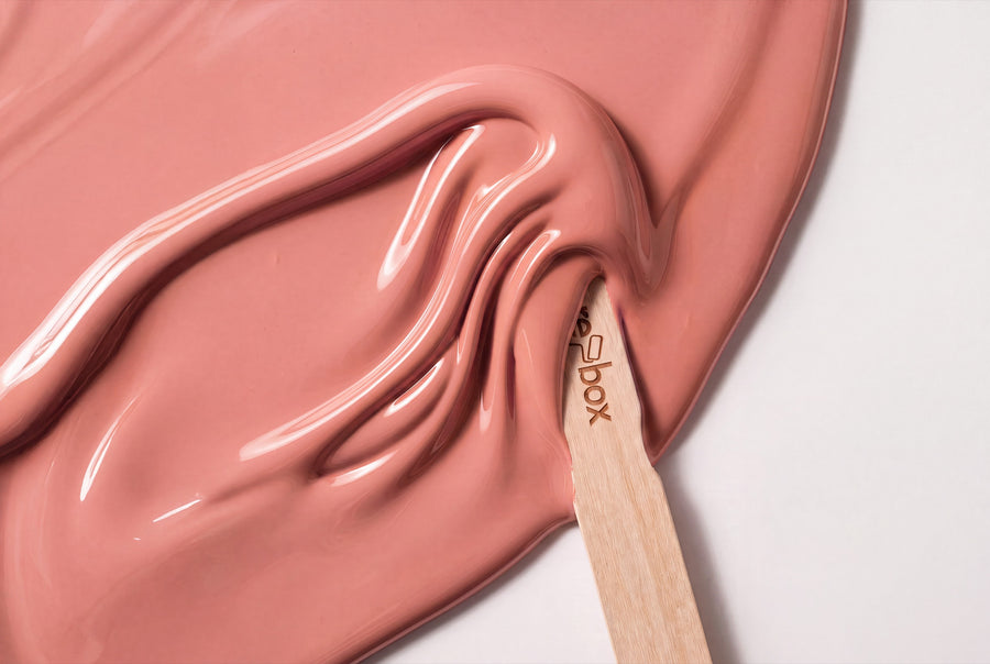
Powder, dusty rose, a rosé with a hint of ash: re-box lists eight shades under pink, and none of them have anything to do with icing sugar. The range starts where you'd barely call it pink anymore — a broken white with a warm undertone. Only at the dark end does it become a colour you'd recognise as such from across the room.
Buy pink furniture paint: eight shades from powder to aubergine
All eight shades in this category are re-box protect, the satin-sheen furniture and multi-surface paint in the 750-ml tin. Mixing happens only after you order, so every tin is made just for you.
Before the paint comes re-box core, the adhesion primer. It bonds well on a wide range of surfaces. Stick to the order — core first, then protect — and you'll save yourself extra work.
Between two neighbouring rosé shades there's often just a nuance: barely visible on screen, obvious on the front of a piece. The colour sample box holds 65 shades as swatches to hold up against your walls — with these tones, it's the light in your home that decides.
The eight nuances, from almost white to almost violet
Pink is a family with a wide range. These eight shades cover it from the lightest to the darkest corner.
Rosé you only notice at second glance
Blanc Épuré No. 55 Lack is the lightest of the group: a clear white whose warm core only reveals itself next to a cooler white. Lin Clair No. 58 Lack goes a step further towards linen and reads more as light than as coloured on doors and frames. Both are the right choice when pink should just be a mood in the room, not a statement.
Powder and silk
This is where recognisable pink begins. Soie Blush No. 59 Lack is a delicate, silky rosé that almost shimmers on smooth fronts. Pierre Douce No. 41 Lack has more stone than blossom in it — a gentle, slightly greyed tone that also works in sober rooms.
Muted dusty rose
Muted Rose No. 29 Lack is the dusty rose of the range: muted, calm, with enough grey to keep it from looking sweet. Rose Ash No. 13 Lack takes away a touch more colour and lays ash over it. On an old chest of drawers, this tone looks like it has always been there.
The dark pink shades
Château Rose No. 38 Lack has a red core and becomes noticeably bolder on large surfaces than the swatch suggests. Aubergine Mist No. 20 Lack is the darkest shade in the category and leans towards violet — good for a single piece of furniture allowed to take the lead role in the room.
What pink does to a room
Pink is a lightened red. It brings warmth without carrying red's energy along with it — which is why pink surfaces feel calm rather than stimulating. How warm or cool a shade ultimately looks depends on its grey content: the more grey, the more matter-of-fact the pink becomes. Pierre Douce and Rose Ash are cool and muted, while Soie Blush and Château Rose stay clearly on the warm side.
In north-facing light, which is bluish, pink loses warmth and the cooler nuances can slip slightly towards grey. If you're painting a north-facing room, you're better off with Soie Blush or Muted Rose than with Rose Ash. South-facing light does the opposite: it emphasises the red content, and Château Rose can look noticeably more intense at midday than in the evening under lamplight.
On furniture, the satin sheen plays its part. A lacquered surface reflects light, so a pink tone looks fresher on it than on a matte wall. That's why furniture often carries the darker shades in the range better than a wall does: the sheen lifts the heaviness.
Where pink lacquered surfaces look good
Living room
A sideboard in Muted Rose or a shelf section in Aubergine Mist is usually enough. In the living room, pink works better as a single piece than covering every surface — otherwise the tone competes with textiles and rugs.
Bedroom
This is the room where pink looks most natural. A wardrobe or a bed's back panel in Soie Blush softens the room without dressing it up. For something more grown-up, go for Rose Ash.
Kitchen
Pink kitchen fronts are bolder than they sound — especially in the muted nuances. Pierre Douce paired with a light wood worktop makes for a kitchen that feels friendly without looking like a theme. For more on order of work and effort, see Painting a kitchen: guide, costs, colour.
Hallway
In a hallway, every surface counts double. Doors in Lin Clair or Blanc Épuré keep it light; a hallway bench in Château Rose gives it the colour you see the moment you walk in.
Children's room
Here it pays not to choose the lightest pink: Muted Rose and Pierre Douce grow with the room.
Matching colours, woods and materials
Pink needs a counterweight, or it turns soft to the point of blandness. Three directions work reliably:
- Balance it out with neutrals: Gesso Clair No. 57 Lack and Dove Horizon No. 26 Lack give pink surfaces an edge without taking away their warmth. The dove grey is the calmest partner for all muted rosé tones.
- Set off with dark: One element in Charbon Nuit No. 49 Lack — a handle rail, a plinth, a single frame — turns a soft room into a composed one. Velours Shade No. 22 Lack is the warmer alternative to it.
- Woods and metals: Light oak and birch sit well with the cool nuances, walnut and cherry with the warm ones. Brass strengthens the red undertone, matte black fittings pull it back. Linen, bouclé and unpolished stone go with all eight shades.
And white to go with it: walls and ceiling in a light, gently broken white let pink furniture read as colour. Pure, cold white next to it, on the other hand, quickly makes it look pale.
Silk sheen, surface and how much you need
re-box protect has a silk sheen, not a high gloss. The lacquer is resistant to mechanical wear, everyday dirt and outside influences, making it suited to furniture, wood and interior surfaces that are actually used.
The surface needs to be clean, dry, stable and free of loose material. On old, glossy furniture that means: sand it down, remove the dust, then the primer, then two thin coats of lacquer. We deliberately don't give a blanket figure for how many square metres you get from one tin — with lacquer that depends on absorbency, edges and the number of coats. Measure your piece of furniture and plan for two coats; Anna, re-box's digital colour consultant, can help you work out the quantity.
For the wall paint in the same shade, though, we do have guide values: 2.5 litres cover approx. 8–10 m² with two coats, 5 litres approx. 15–20 m², and 10 litres approx. 30–40 m². If you'd rather work it out yourself, Wie viel Wandfarbe brauche ich walks you through the calculation.
Pink on the wall: the matching wall paint
Whatever exists as a lacquer usually exists for the wall too: around 65 colour names at re-box come in both versions. The wall shades of this family are under Wandfarben Rosa, and there you'll find two finishes: the matte base one for walls and ceilings, and the silky-matte silk matte, which is hard-wearing and very easy to clean.
For a tone-on-tone look, use the same name for both, for instance Muted Rose No. 29 on the wall and the matching lacquer on the door. Wall paint and lacquer are two different materials with different sheen levels. The same shade looks a touch fresher on the silky sheen than on the matte wall — that's not a flaw, it's just physics.
Frequently asked questions about pink lacquer colours
Does pink lacquered furniture quickly look childish?
Only if the shade is very light and very clear. The muted nuances with a touch of grey — Pierre Douce No. 41, Muted Rose No. 29, Rose Ash No. 13 — read as grown-up, because they lack that sweetness.
Which shade of pink suits a room with a north-facing window?
Choose a shade with a warm core, such as Soie Blush No. 59 or Muted Rose No. 29. North light is bluish and draws the warmth out of pink; coolly muted shades like Rose Ash can end up looking grey rather than pink there.
What's the difference between Muted Rose No. 29 and Rose Ash No. 13?
Muted Rose has more colour, Rose Ash more grey. Side by side, Rose Ash reads almost like a grey with a hint of pink, while Muted Rose stays clearly recognisable as dusty pink.
Can I lacquer a dark chest of drawers pink directly?
Not without preparation. Sand it down, remove the dust and apply the core primer — otherwise the dark base will show through the light pink tones, and you'll need far more coats than planned.
How much lacquer do I need for a chest of drawers?
We don't give a general square-metre figure per tin, because with lacquer it's too often wrong. Add up the visible surfaces, plan for two coats, and for bigger projects ask Anna for a recommendation.
Does pink lacquer go with brass?
Yes, especially with the warm shades. Brass lifts the red undertone and turns Soie Blush or Château Rose into a visibly warm surface. With coolly muted shades like Rose Ash, matte black or steel-coloured fittings look more fitting.
Are the pink shades also available for walls and ceilings?
Yes, the same colour names are available as wall paint in matte and silk matte. Since both are mixed only after you order, they're excluded from the right of withdrawal — which is exactly why it's worth getting a sample first. Delivery takes 3–5 working days from receipt of payment.


