


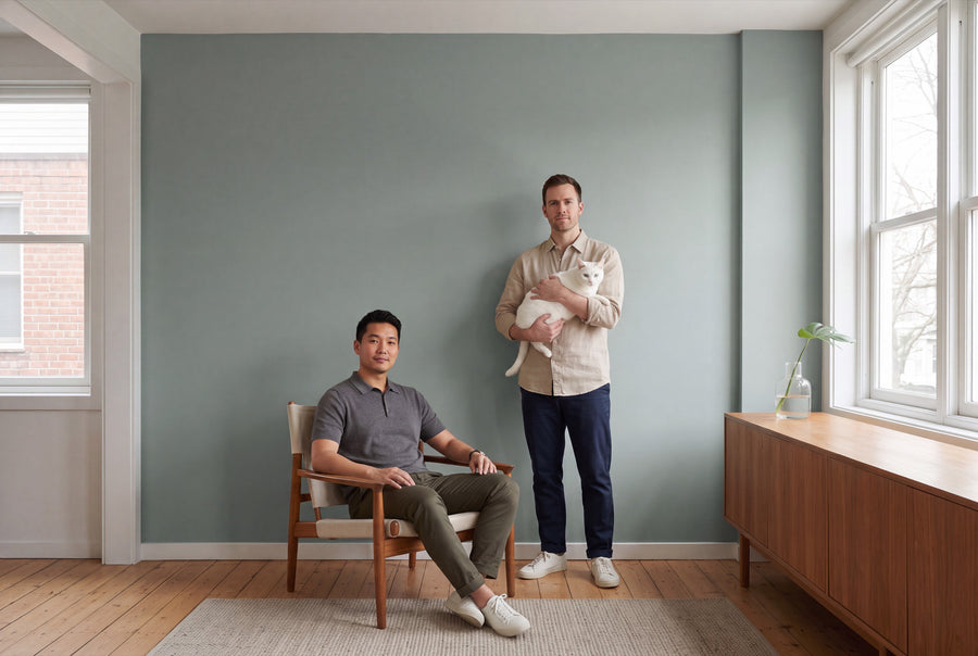
Few colours transform a room as reliably as blue. It visually pushes the wall back, makes the room feel cooler, and brings a clarity you feel more than see. re-box offers 18 shades of blue to choose from, plus the custom colour for everything in between.
Buy blue wall paint: 18 shades in two finishes
You choose the shade first, then the quantity — 2.5, 5 or 10 litres — and finally the material: matt for calm surfaces, satin matt for anything that takes a knock. Your blue is only mixed after you order, in exactly this combination. That's why a midnight blue can sit right next to a pale grey-blue on the shelf, with neither one left to languish.
If something's missing between two shades, there's the custom colour – individually mixed. And if you're torn between three favourites, the sample card is quicker than any screen: blue tones are rarely reproduced on screens the way they'll actually look on the wall.
What blue does to a room
Blue reads as cool, and that has consequences for how a room feels: walls recede, ceilings seem higher, tight rooms get breathing space. At the same time, it's the colour that stirs up the least restlessness. If you want to unwind, read, or concentrate in a room, blue is hard to beat.
With light, though, you need to take care. North-facing rooms already get cool, even light — a clear, cold blue can feel unwelcoming there. In that case, choose the shades with a touch of grey, green, or violet; they carry enough warmth to balance it out. In south-facing rooms, almost anything works: the warm afternoon light carries even a rich cobalt blue and turns it velvety by evening.
A second point concerns the dark shades: a deep blue absorbs light, even during the day. That's not a drawback as long as you use it deliberately — as a wall behind the bed, or as the back of a shelf.
From pale haze to ink: the shades
Blue that's almost white
These shades read as white at first glance, and you only notice the blue on comparison. Gesso Clair No. 57 feels chalky and bright, Celadon Tide No. 3 understated and everyday, Brise d'Été No. 61 light and summery. For ceilings and small rooms, they're the lowest-risk way to bring blue into your home.
Grey-blue and mist
The largest and most practical group. Dove Horizon No. 26 sits between dove grey and blue, Fjord Mist No. 39 carries the haze over the water in both name and effect, Nice Breeze No. 36 stays lighter and fresher. Loom Spirit No. 14 also belongs in this corner. These shades work equally well alongside grey, beige and raw wood, which makes them the safe choice for entire homes.
The clear mid-blue
Here blue is recognisably blue. Azure Bay No. 25 is the open, bright azure tone, Bleu Faïence No. 64 brings glazed ceramics to mind, Harbour Blue No. 18 is bolder and more maritime, Bleu Salon No. 63 is calmer and a touch more elegant. In this group, a sample swatch really pays off, because a single nuance can decide the whole character of a room.
Blue with a hint of green or violet
Blooming Tisane No. 37 leans towards green, which makes it softer than a pure blue. Velours Shade No. 22 goes the other way, towards violet, gaining a velvety depth in the evening under artificial light. Both answer the question of how blue can turn warm.
The dark blue shades
Océan Nuit No. 65 is the night blue of the palette, Baltic Midnight No. 24 goes a shade deeper and cooler still. Blue Dark No. 27 is the rich, clear dark blue without any frills, and Cobalt Husk No. 35 brings the luminosity of cobalt. These four can carry a wall on their own, needing no second colour in the room.
What blue pairs with
The most natural pairing is wood, and light wood at that: oak, ash, pine. The warm yellow undertone in the wood is the counterpart to cool blue, and together the two feel balanced right away. This also works with dark walnut, but only with the lighter blue shades — otherwise the room turns heavy.
Brass and warm metal suit blue well, while chrome metal amplifies its coolness. For textiles, linen, wool and anything undyed are the simplest answer. And then there's white: for doors, skirting boards and windows, choose a white with a touch of warmth rather than a blue-white. Otherwise two cool tones collide and the room loses all depth. Grey is also a good neighbour — a light grey on three walls and dark blue on the fourth is a combination that rarely goes wrong.
Blue in each room
Bedroom
The strongest room for blue. Dark shades don't feel gloomy here, but sheltering, since you mostly see the room in soft light anyway. If you're feeling bold, paint the ceiling too — the room then loses all its edges.
Living room
A mid-tone blue on a single wall is usually enough. It gives the room direction without requiring you to match every piece of furniture to it. On large surfaces, matt looks calmer than silk-matt.
Kitchen
Blue alongside wood and white is a safe classic in the kitchen, especially in the mid and dark shades. Since splashes and steam come with the territory here, the silk-matt finish belongs here too.
Bathroom
A light grey-blue makes a windowless bathroom feel bigger, while a deep blue turns it into a cave — both work, as long as you commit to one. Silk-matt is the given choice here.
Study
At the desk, blue shows its calm side: the tone holds back and doesn't intrude at the edge of your vision. A grey-blue behind the screen feels softer than pure white.
Hallway
The hallway is worth being bold in, since you never linger there for long. A dark blue with white doors turns the passageway into the room with the most character in the whole home.
The finish your blue needs — and how much of it
Matt makes blue look deeper and more velvety; the surface stays calm, since no light is reflected back. Silk-matt is especially hard-wearing and very easy to clean — which is why it suits kitchens, bathrooms, hallways and children's rooms. With dark blue shades, that's one more argument for silk-matt, since such surfaces get touched more often in everyday life.
For quantity, with two coats: 2.5 l covers approx. 8–10 m², 5 l approx. 15–20 m², 10 l approx. 30–40 m². With bold and dark blue shades, plan firmly on two coats. On very dark, strongly coloured or uneven surfaces, consumption can increase further; the exact calculation is set out in How much wall paint do I need?.
Suitable for all common, load-bearing interior surfaces: plaster, wallpaper and existing old paintwork. The surface must be clean, dry, load-bearing and free of loose material. On fresh or highly absorbent plaster, a primer ensures even drying and lowers consumption. After about 24 hours, you can generally use the room normally again.
Blue lacquer for doors, windows and furniture
The same blues are also available as furniture and gloss lacquer, found under Blue Lacquers. The lacquer has a silky sheen, making it a complement to the wall paint rather than a copy of it: they’re two different materials that simply share the same colour. This combination works especially well on doors — a door lacquered in dark blue against a light blue wall makes more of an impression than any piece of furniture. To see how this works without removing the door, take a look at Painting a Door Without Removing It. On wood and furniture, apply the re-box core primer first, then the lacquer.
Frequently asked questions about blue wall paint
Does blue make a room feel smaller?
No, blue walls tend to recede visually and can make a room feel larger. What a dark blue actually does is absorb light, so it suits rooms with a large window better than dark, windowless spaces.
Which blue suits a north-facing room?
Best is a shade with a touch of grey, green or violet, as it balances the cool northern light. A clear, cold blue can quickly look harsh there.
Will a dark blue cover a white wall in one coat?
With bold and dark shades, always plan for two coats. The quantities above are calculated exactly for this: 1 litre covers approx. 6–8 m² per coat.
Can I paint blue in the bathroom?
Yes, with the silky-matte finish, which is especially hard-wearing and easy to clean. As always, a clean, dry and stable surface is essential.
Is my blue also available for the door?
Yes, all 65 colour names are available as both wall paint and lacquer. You’ll find the matching shade in the Blue Lacquers category, and on wood, the primer goes on first.
How can I check beforehand whether my blue will work?
With the Farbmusterbox, which contains all 65 shades as samples. Hang it on your wall for a day and look at it in the morning, at midday and under lamplight — with blue, the difference is greater than with any other family.
How long does delivery take?
3 to 5 working days from receipt of payment, within Germany. Because each shade is mixed individually for you, it is excluded from returns and exchanges.


