


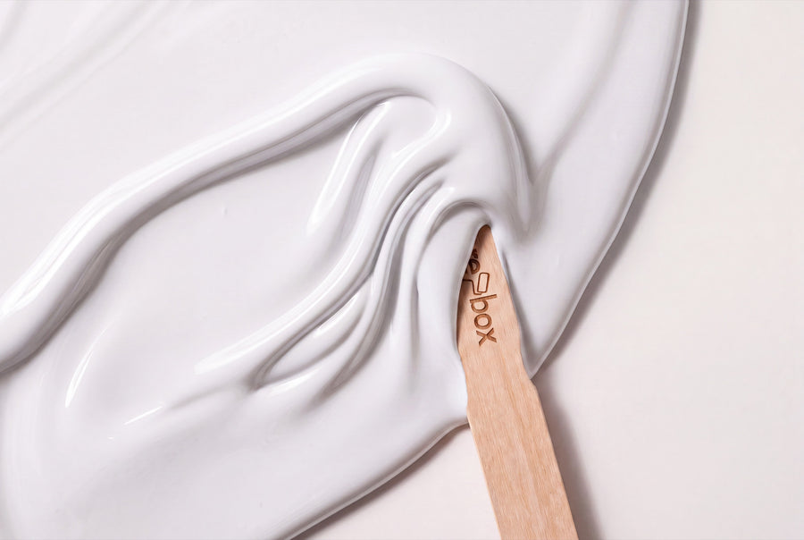
White lacquer colours aren't an absence of colour — they're a decision, and one you notice on a door straight away. Between a cool chalk white and a warm linen white lie only a few drops of pigment, yet in a finished hallway they're worlds apart. Every one of these white shades is tinted in re-box protect, the satin-sheen furniture and multi-purpose lacquer.
Buy white furniture lacquer: one lacquer, many shades of white
At re-box there's exactly one lacquer for furniture, wood and interior surfaces — available in every shade of the range. Of around 66 lacquer shades, a good dozen are white or near-white: from paper-bright through cream and linen to tones already leaning towards stone. The tin holds 750 ml, with a satin sheen finish.
- ✔️ satin sheen — with lacquer, the finish is fixed, you only choose the shade
- ✔️ 750 ml per tin
- ✔️ every white shade is mixed only after you order
- ✔️ made for furniture, wood and interior surfaces
Because it's mixed individually, you're not getting a tin off a shelf — you're getting your shade. The flip side: mixed paint is excluded from withdrawal and exchange. So it's worth taking the detour via the Farbmusterbox 65 Stk. Delivery takes 3–5 working days from receipt of payment.
Unlike on a wall, where you choose between matt and silk matt, the question of finish is already answered with lacquer. Satin sheen is also exactly what you want on furniture: it resists mechanical wear, everyday marks and outside influences — in other words, whatever door handles, shoes and cooking spoons throw at it.
How white behaves on wood — and why it shifts in a north-facing room
White has hardly any strength of its own — it takes on the light of the room. North light is cool and slightly blue. A white with a grey or blue undertone quickly slides towards grey in it and can look harsh, almost clinical. South light, on the other hand, is warm; a creamy shade can look noticeably yellower by the afternoon than the one you chose.
The rule of thumb holds: north-facing rooms suit warm whites with a touch of cream, linen or vanilla, while south- and west-facing rooms can take the clear, cool ones too. In the evening, artificial light shifts everything again — warm-white lamps pull every white towards yellow.
On wood, the surface itself plays a part too: the same shade looks warmer on an old oak door than on a smooth front. So hold the sample against the actual piece you're painting — and look at it both morning and evening.
From chalk white to stone white: the nuances within white lacquer
White isn't one shade, it's a family. These five groups help with sorting — each has a different undertone, and that's what decides whether your furniture looks fresh, soft or severe.
Clear and cool
This is the white people mean when they say white: bright, clean, without noticeable warmth. Blanc Épuré No. 55 Lack is the clearest of these shades and suits modern fronts well. Neige Douce No. 42 Lack carries a touch more softness while staying cool. Wisp No. 4 Lack sits between the two and looks especially light on slender elements like glazing bars or shelves.
Warm, with a drop of cream
These shades carry a hint of yellow underneath and take the hardness out of a piece of furniture. Lait Vanillé No. 56 Lack is the friendliest of them and suits period buildings and country-style interiors. Blanc Pêche No. 47 Lack also carries a light peach shimmer that works wonders in north-facing rooms. Bone China Glow No. 12 Lack recalls porcelain: warm, but not creamy.
Linen instead of paper
Linen white carries a barely visible hint of beige, giving it a lived-in feel rather than a brand-new one. Lin Clair No. 58 Lack is the starting point of this group. Linen Veil No. 11 Lack takes it a step further towards sand. Linen Wash No. 2 Lack is the calmest of the three and sits well on large wardrobe surfaces, where a clear white would look too harsh.
Chalk and lime
Chalky whites look muted and old-fashioned in the best sense. Craie Ancienne No. 60 Lack brings exactly this feel to lacquered surfaces — lovely on panelled doors and farmhouse cupboards. Gesso Clair No. 57 Lack is a touch lighter and more neutral, and stays calm even alongside modern materials.
White that's almost grey
Where white ends, greige begins, and the transition is fluid. Pierre Douce No. 41 Lack has a soft stone tone and keeps furniture unobtrusive. Sel Marin No. 54 Lack leans slightly cool and suits anything styled maritime or Scandinavian.
Surface and build-up: core first, then protect
White lacquer forgives little — every dent and every grease mark will show through later. That's why the order is fixed: first the adhesion primer re-box core, then the lacquer. core adheres well to a wide range of surfaces, which is exactly why the lacquer holds at all on an old kitchen front.
The surface must be clean, dry, load-bearing and free of any loose material. Sand old, glossy lacquer finishes to a matt surface first and wipe away the dust thoroughly. Fill holes and edges before priming — once you've lacquered, it's too late. Apply two thin coats rather than one thick one: thick coats run at edges.
You don't need to remove doors for this, by the way. You'll find the step-by-step method in Tür lackieren ohne Ausbauen.
Where white lacquer turns up around the house
Doors and frames in the hallway
The hallway is the most common home for white lacquer. Doors in a warm white take the tightness out of a dark corridor without you having to touch the walls at all. It's important to lacquer the door and frame in the same shade — two different whites side by side is always noticeable.
Kitchen fronts
Old fronts in white are the classic weekend project. A creamy shade makes a cool kitchen feel friendlier, a clear white keeps it calm and graphic.
Shelves and sideboards in the living room
On large pieces of furniture, pure white can often look harsh. Linen and chalk shades hold the piece back rather than putting it centre stage — so books and pictures get the attention.
Chest of drawers and bench in the bedroom
In the bedroom, white is allowed to be soft. A shade with a touch of beige or peach means the piece won't dazzle you in the morning or turn yellow under lamplight in the evening.
Stair treads and railings
A white railing above dark treads is a reliable classic. Heavily used parts need a particularly careful build-up; you'll find the order to follow in Treppe streichen: Anleitung für die Holztreppe.
What looks good alongside white lacquer
White gets along with almost any colour — but only if the undertones match. Warm whites sit well with oak, pine, rattan, linen and brass. Cool whites work better next to ash, concrete, stainless steel and chrome. Walnut and dark woods need a white with a touch of warmth, otherwise the contrast looks cold.
It gets interesting when the wall and the furniture don't do the same thing: a deeply coloured wall with a white piece of furniture in front of it. You'll find the whole lacquer range under Lackfarben. A tip from practice: keep the number of whites in one room small. Two make a concept, four make it look like an accident.
Silk sheen on furniture, matt on the wall
The same shade is available for both — as lacquer and as wall paint. They are, however, two different materials: the lacquer is re-box protect, the wall paint is base one (matt) or silk matte (silk-matt). Only the shade matches, not the formula. You'll find the white wall paints under Weiß.
If you're painting the wall and the furniture within the same project, this quantity guide for the wall paint will help: 2.5 l is enough for approx. 8–10 m² with two coats, 5 l for approx. 15–20 m² and 10 l for approx. 30–40 m². The lacquer, meanwhile, comes in 750 ml tins — doors, fronts and shelves are smaller surfaces, and you'll be working in thin coats anyway.
Frequently asked questions about white lacquer paints
Which white suits a door in a dark hallway?
A warm white with a touch of cream, linen or peach. Cool whites tend to look grey and harsh in low daylight, while warm shades bring light into the corridor instead. Look at the sample in the evening with the lamp switched on, since that's usually how the hallway is actually experienced.
Do I need to prime before applying white lacquer?
Yes, on furniture and wood, re-box core belongs under the lacquer as an adhesion primer. It ensures grip on a wide range of surfaces — without it, the lacquer can chip off again at heavily used edges. First core, then protect, that's the whole order.
Is the same white shade also available as a wall paint?
Yes, most colour names are available both as lacquer and as wall paint. The shade is the same, the material isn't: on the wall you work with base one or silk matte, on furniture with protect. The matching category is Weiß among the wall paints.
How do I test a white shade before lacquering?
With the colour sample box, which holds all 65 shades as samples. White shades differ mainly in undertone, and that only shows up in the light of your own room. Hold the sample directly against the piece of furniture you plan to paint.
Can I return mixed lacquer?
No, individually mixed paints are excluded from withdrawal and exchange. This applies to white too, since white is also only mixed after your order. Separately labelled white stock items can be returned as long as they're undamaged and in their original packaging.
How long does delivery take?
3–5 working days from receipt of payment. Delivery within Germany is by parcel, with no additional shipping costs.


