


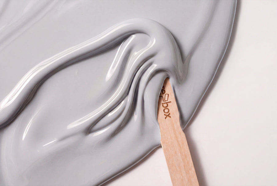
Neutral paint shades are the tones you don't notice as colour in a room, but as calm. re-box carries nine of them: linen, chalk, vanilla, a cool sea salt, a grey with a hint of horizon. They're made for doors, fronts and pieces of furniture that should belong to the room without taking it over.
Buy neutral furniture paint: nine shades for doors, fronts and furniture
This category covers nine neutral shades, all available as re-box protect, the satin-sheen furniture and multi-surface paint in the 750-ml tin. Every shade is mixed only after your order comes in.
The build-up is the same for all nine: first re-box core as an adhesion primer, then the paint in thin coats. core adheres well to a wide range of surfaces.
The same shade is also available from re-box for the wall — as a matt or satin-matt interior paint in 2.5, 5 and 10 litres. Wall and furniture are two different materials. The shade stays the same.
Why neutral shades settle a room
A neutral shade has no loud dose of colour. It's made up of a light base value and a quiet direction: a drop of yellow turns it into linen, a drop of blue into a sea salt, a drop of red into a rosé that almost no one reads as pink. It's exactly this direction that decides whether a room tips warm or cool.
North light is bluish and draws the warmth out of light shades. A cool neutral quickly looks grey and flat there — a linen or vanilla shade holds its ground and stays friendly. South light brings yellow with it: it makes warm shades turn creamy and can leave them looking oversaturated at midday. That's where the cooler nuances work more calmly.
On painted furniture, the satin sheen adds another layer. A painted front picks up the light that's already in the room. The same shade therefore looks livelier on a cabinet door than on the wall right next to it. Anyone who paints both in the same shade doesn't end up with one flat surface, but with two levels of brightness working together.
From chalk white to dove grey: the nine nuances
Sorted from light to dark and by their direction — so you can find which of the nine shades suits your light more quickly. If the surfaces underneath still have cracks or old dowel holes, read Preparing walls properly first.
Clear whites with different temperatures
Blanc Épuré No. 55 Lack is the crisp white of the range: clear, with no visible yellow cast, good for doors in bright rooms. Neige Douce No. 42 Lack is the softer version — a snow white that's ever so slightly broken and therefore feels less technical. Gesso Clair No. 57 Lack has the chalky look of primed painting ground and suits furniture with visible texture.
Linen, sand and vanilla: the warm middle
Lin Clair No. 58 Lack is the friendliest of the nine: a light linen that doesn't turn cold even in low daylight. Linen Veil No. 11 Lack sits a touch sandier and has more body. Lait Vanillé No. 56 Lack leans clearly towards cream and noticeably warms a room without turning yellow.
Cool, broken shades with a grey undertone
Sel Marin No. 54 Lack is a broken white with a cool core — the shade for rooms that get plenty of south light and can take some counterweight. Dove Horizon No. 26 Lack is the darkest of the range: a dove grey that draws a calm line on doors and base cabinets.
Neutral with a hint of rosé
Soie Blush No. 59 Lack is, strictly speaking, a rosé, but it reads like a neutral with a warm undertone. On a chest of drawers, you only recognise it as colour once you come closer — before that, it simply looks soft.
What neutral paint shades pair well with
Neutral shades are combination colours. Their advantage is also their trap: because everything goes with them, a room without a statement can appear all too quickly.
- Woods: Light oak and ash sit on the same temperature side as Lin Clair and Linen Veil — that creates a calm, almost invisible transition. Walnut and smoked oak need the contrast of the cooler shades, otherwise things turn syrupy.
- Materials: Linen, wool and unpolished stone reinforce the warm nuances. Brass feels natural next to vanilla and linen, while brushed steel suits Sel Marin and Dove Horizon better.
- Accents: A single piece of furniture in Forge Grey No. 28 Lack or Velours Shade No. 22 Lack gives a neutral room the grounding it would otherwise lack. If you prefer it softer, choose Muted Rose No. 29 Lack for one small piece.
And the white to go with it: ceiling and wall surfaces in a light tone hold the lacquered surfaces together. If you want the same colour on the wall, Lin Clair No. 58, for instance, is also available as a wall paint.
Neutral lacquer surfaces, room by room
Living room
A sideboard or built-in shelf in Leinen or Vanille recedes visually and leaves room for everything placed on it. In the living room, that's usually the better choice than a piece of furniture that wants to speak for itself.
Bedroom
Here, the warm shades pay off. A wardrobe in Lait Vanillé or Linen Veil catches the morning's first light and feels softer than a white front. Cool tones can quickly look like a furniture showroom in a bedroom.
Kitchen
Kitchen fronts are the surface that has to endure the most. A neutral tone hides signs of wear better than pure white, and Sel Marin or Gesso Clair work just as well with wooden worktops as with stone.
Hallway
Hallways rarely get daylight. Blanc Épuré and Lin Clair keep them bright without making them feel sterile. Doors in Dove Horizon, by contrast, set a clear edge.
Study
At the desk, colour that draws the eye is a distraction. A shelf in Neige Douce or Gesso Clair stays in the background and lets the rest of the room do the work.
What you need to know before the first coat
re-box protect is a satin-gloss furniture and lacquer paint for furniture, wood and interior surfaces. It's resistant to mechanical stress, everyday dirt and outside influences — exactly what a kitchen front or a well-used door needs.
The surface must be clean, dry, load-bearing and free of loose particles. Sand it lightly, remove dust, then apply the core primer, followed by the lacquer in two thin coats rather than one thick one. You'll find step-by-step guidance on how to paint a door without taking it off its hinges in Painting a door without removing it; the edges between wall and frame are covered in Taping correctly without paint bleed. How many doors you get out of a 750 ml tin depends too much on surface area, absorbency and number of coats for any general figure to be honest — measure the surface, plan for two coats, and if in doubt, ask Anna, re-box's digital colour consultant.
For the wall paint in the same tone, though, there are clear guide values: 2.5 litres cover approx. 8–10 m² with two coats, 5 litres approx. 15–20 m², 10 litres approx. 30–40 m². The matte base one is the classic choice for walls and ceilings, while the satin-matte silk matte is hard-wearing and very easy to clean — practical wherever hands come into contact with it.
The same neutral tones for the wall
Around 65 colour names exist twice at re-box: once as a wall paint, once as a lacquer. That's why door and wall can be matched exactly, without you having to hold two colour cards side by side. You'll find the matching wall tones under Neutral tones.
Tone on tone makes small rooms feel larger, because the edges disappear. A gap of two shades, on the other hand, shows that the door was painted deliberately.
Frequently asked questions about neutral lacquer colours
Which neutral lacquer tone suits a light oak front?
Lin Clair No. 58 and Linen Veil No. 11 sit on the same warm side as light oak and create a soft transition. Anyone wanting more contrast should go for Sel Marin No. 54 — its cool core makes the wood look warmer.
Is Sel Marin No. 54 a white or a grey?
Sel Marin is a broken white with a cool grey undertone. In bright south-facing rooms it reads as white, in north-facing rooms clearly as grey — which is why a sample is worth more here than with any other tone in the range.
What's the difference between Blanc Épuré No. 55 and Neige Douce No. 42?
Blanc Épuré is the clearer, more direct white, Neige Douce the softer one. Side by side, the difference is obvious at once; on its own in a room, hardly noticeable — the decision comes down more to the rest of the interior than to the tone itself.
Can I test a neutral lacquer tone in my own light beforehand?
Yes, that's what the colour sample box with 65 shades to try out is for. This is especially worthwhile with neutral tones, since their direction — warm or cool — only becomes clear at your own window.
Do I need a primer before painting?
Yes, re-box core is part of the process as the first step. The primer ensures the lacquer holds on a wide range of surfaces — with old furniture and an unknown previous finish, it isn't optional, it's the reason the surface won't flake later on.
Can I return a mixed lacquer tone if it doesn't end up suiting me?
No, individually mixed colours are excluded from withdrawal and exchange. Since every tin is tinted only after the order is placed, the sample beforehand is the only way to see the tone before it's mixed.
How long does delivery take?
3–5 working days from receipt of payment within Germany. Processing only begins once payment has been received in full, since mixing only starts after that.


